graphic designer, dyslexic, and amateur vegetable gardener.
9am-5pm
Confessions of an External Processor
Cluck-Cluck Yeah!
Zenyum Invisible Braces
Morf Organic Tofu
New Moon Title Sequence
5pm-9am
Letterpress
Silk Screen
About
Contact
Confessions of an External Processor
Confessions of an External Processor,
the debut EP by singer-songwriter Sally Duhon, explores the emotional difficulties of growing up, missing out on love, confronting family trauma, and learning self acceptance. To visually represent the contrasting lyrical and sonic qualities of the songs, the album package utilizes duality. Earthy tones interrupted by bold red, sharp black letter outlined in florals, tongue in cheek illustrations referencing pain. Together, these elements create a striking representation of the raw emotion conveyed in Duhon’s music.
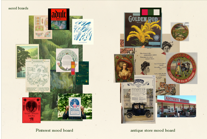
Research Methods
Through directed story telling, I learned that fans appreciate merch that looks cool objectively but gains greater relevance in the context of the music. With moodboarding, I explored different styles I could approach the project through. I created concepts using both internet sources and scanned images from local antique stores.
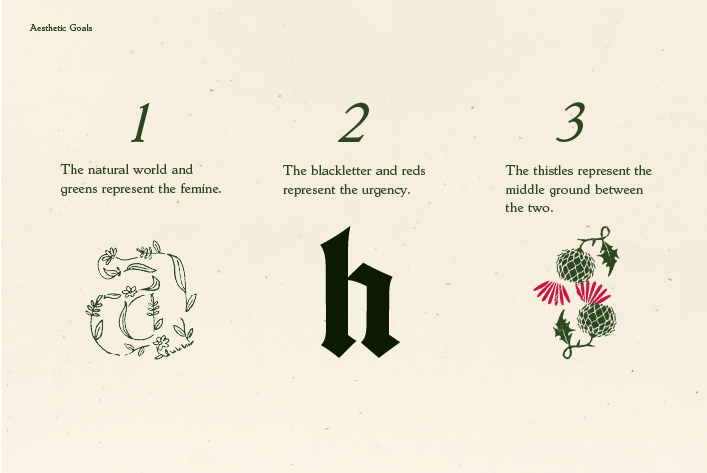
Illustrated Motifs
The natural world and greens represent the feminine, blackletter and reds represent urgency, and the thistles and flower type outline represent the middle ground between the two.
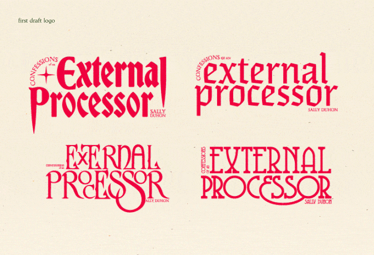
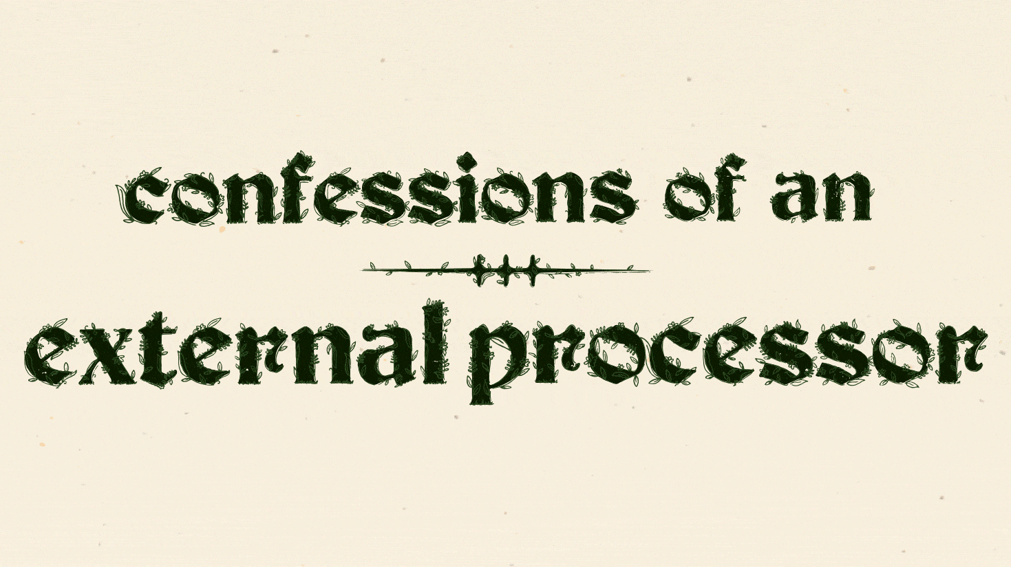
Album Logo
The album logo came through iterations and simplification, using the MSU type collection and an abstracted thistle leaf. The result is a timeless, romantic, and melancholy word mark.
 The Full Album Package consists of a Clamshell Box, Bandana, Lyric Zine, Album Cover, Sleeve, Vinyl, and Poster
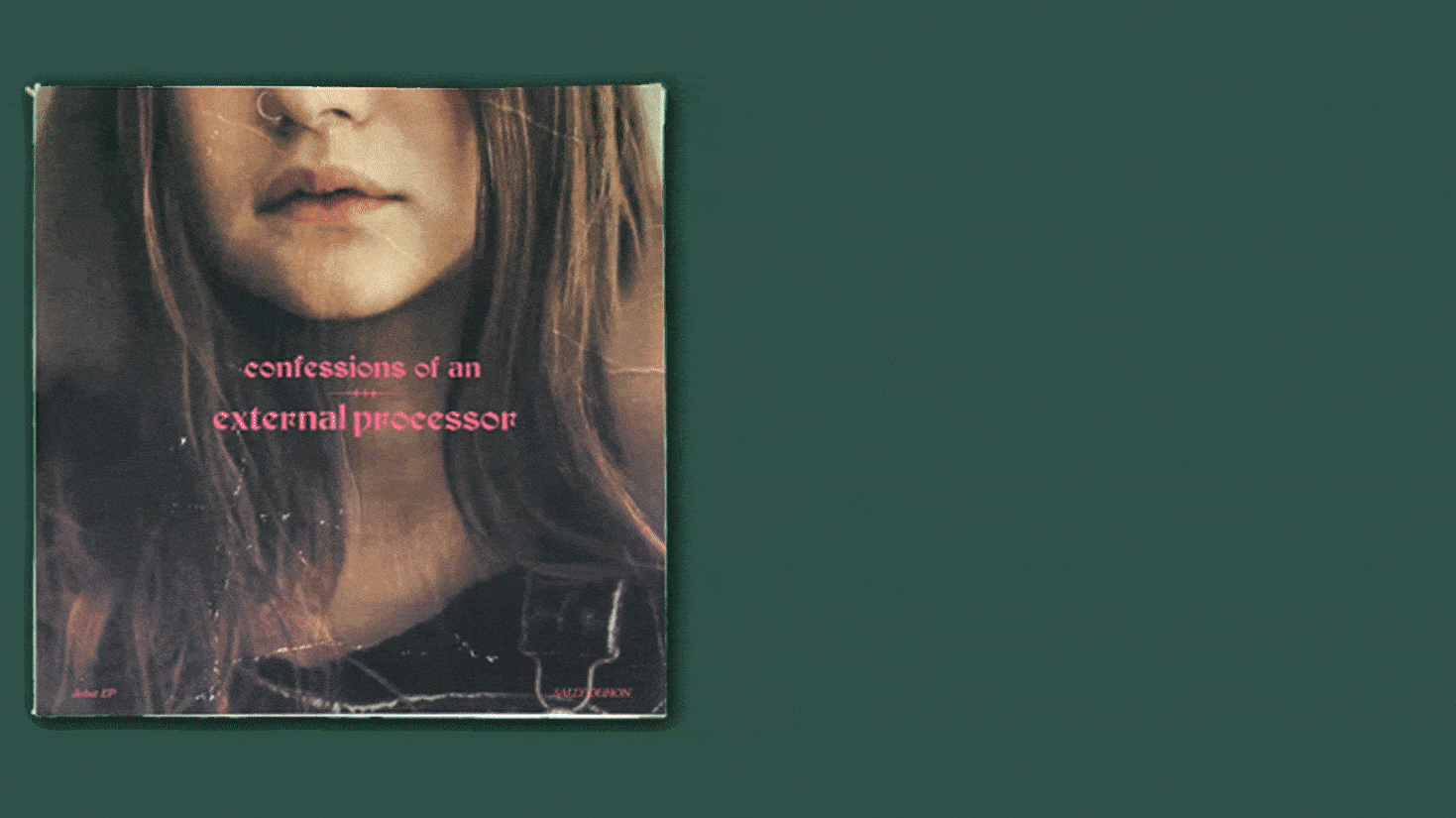
Album Front, Sleeve, and Vinyl

Album Front and Back
The EP's contrasting elements of gentle lyricism and urgent instrumentation are emphasized on the back of the album, where the black letter logo from the front is featured but with a floral outline. This design choice not only complements the overall visual style of the album, but also accentuates its emotional duality.
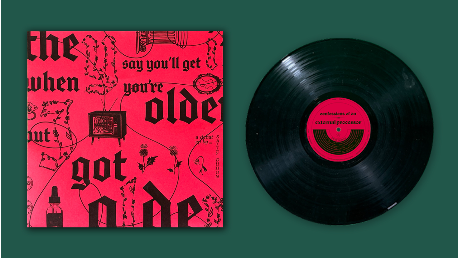
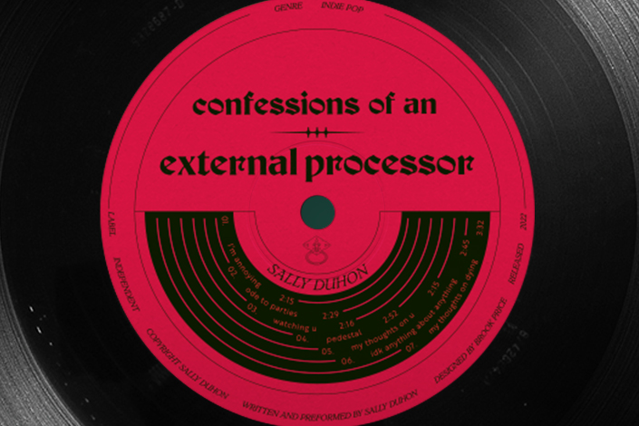
Sleeve and Vinyl
The sleeve and record label contrast the cover. They are loud, red, and loaded with symbolism from the album. The floral outlined letters on the sleeve ensure that the contrast between it and cover are not too harsh. They demonstrate the coexistence of vulnerability and boldness. As a unit, the sleeve, record label and album cover embody the duality of the music. Soft and hard, bold and subtle.

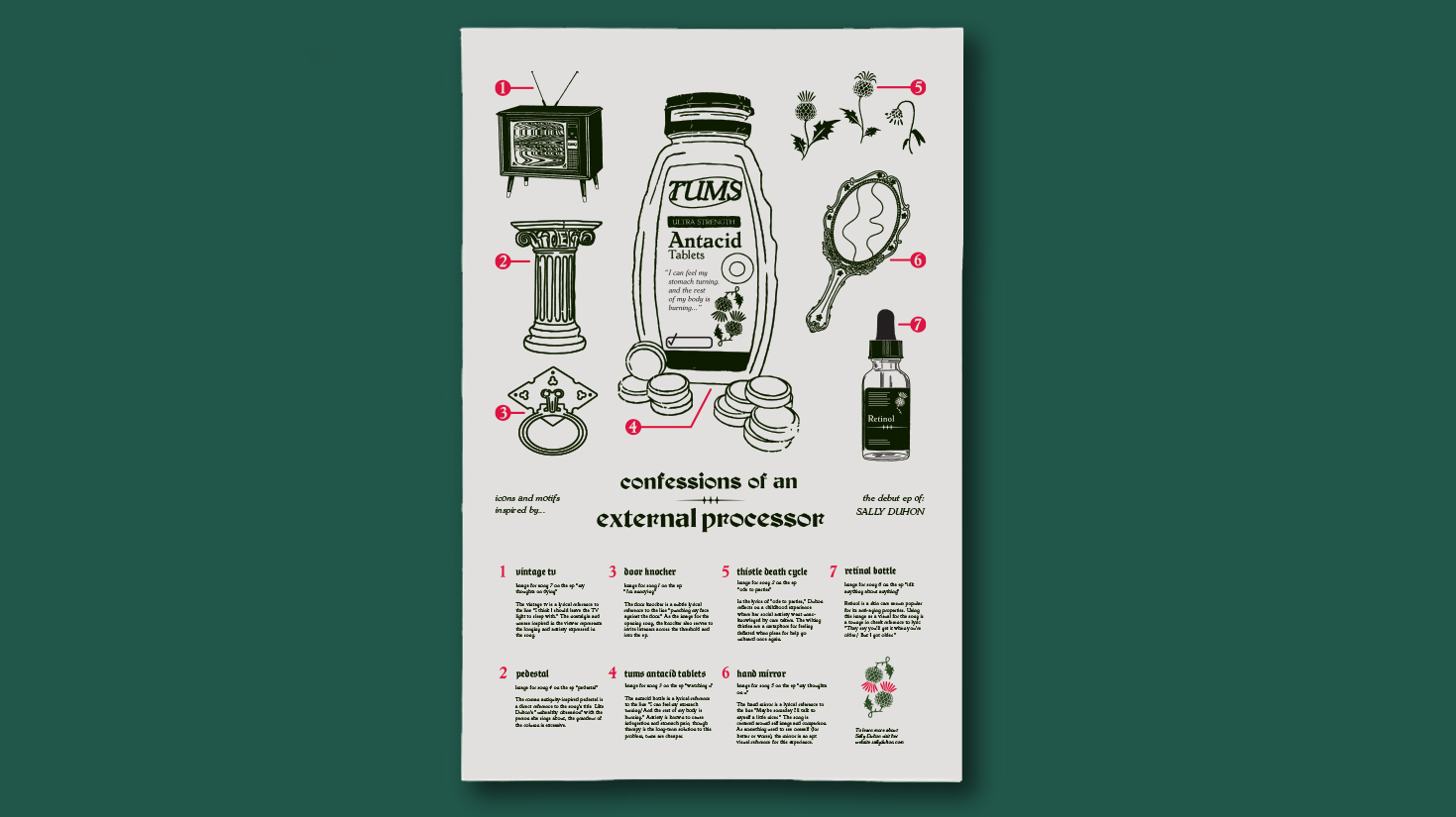
Drawing inspiration from the religious connotations of "confessions," The Lyric Zine's layout mimics a church hymnal. Each song is accompanied by an original illustration referencing a poignant lyric. For instance, a door knocker represents "I'm annoying," wilting thistles symbolize "ode to parties," a hand mirror signifies "my thoughts on you," and an old school TV with eerie static embodies "my thoughts on dying." These visual cues enrich the EP's evocative lyrics with additional layers of meaning.
The Poster explains the illustrated motifs from Sleeve and Lyric Zine.
![]() Illustrated Motifs
Illustrated Motifs
 Illustrated Motifs
The door knocker illustration for the opening track of the EP, "i'm annoying," serves as an invitation for listeners to enter Duhon's story.
The thistle death cycle illustration for "ode to parties," the second track on the EP, represents feeling deflated when pleas for help go unheard.
The Tums bottle illustration symbolizes the stomach pain caused by anxiety as depicted in the third track of the EP, "watching u."
The ornate pedestal illustration for the EP's fourth track, “pedestal,” reflects Duhon's "unhealthy obsession" with the person she sings about.
The delicate hand mirror illustration relates to the central theme of self-image and comparison in the Ep’s fifth track, "my thoughts on u."
The retinol bottle illustration for the EP’s sixth track, "idk anything about anything," playfully alludes to the fear of getting older.
The vintage TV illustration serves as a symbol of the unease and nostalgia portrayed in seventh and final track on the EP "my thoughts on dying."
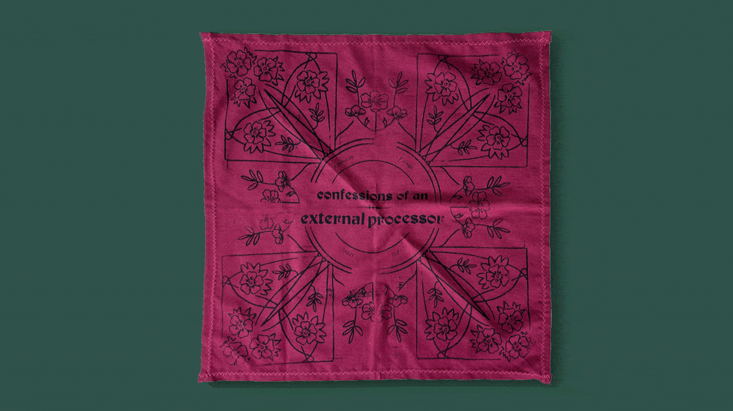 The screen-printed bandana showcases a floral pattern that echoes the floral logo on the album cover, adding a cohesive visual element. Additionally, it serves as a practical accessory, perfect for wiping away tears while listening to the EP.
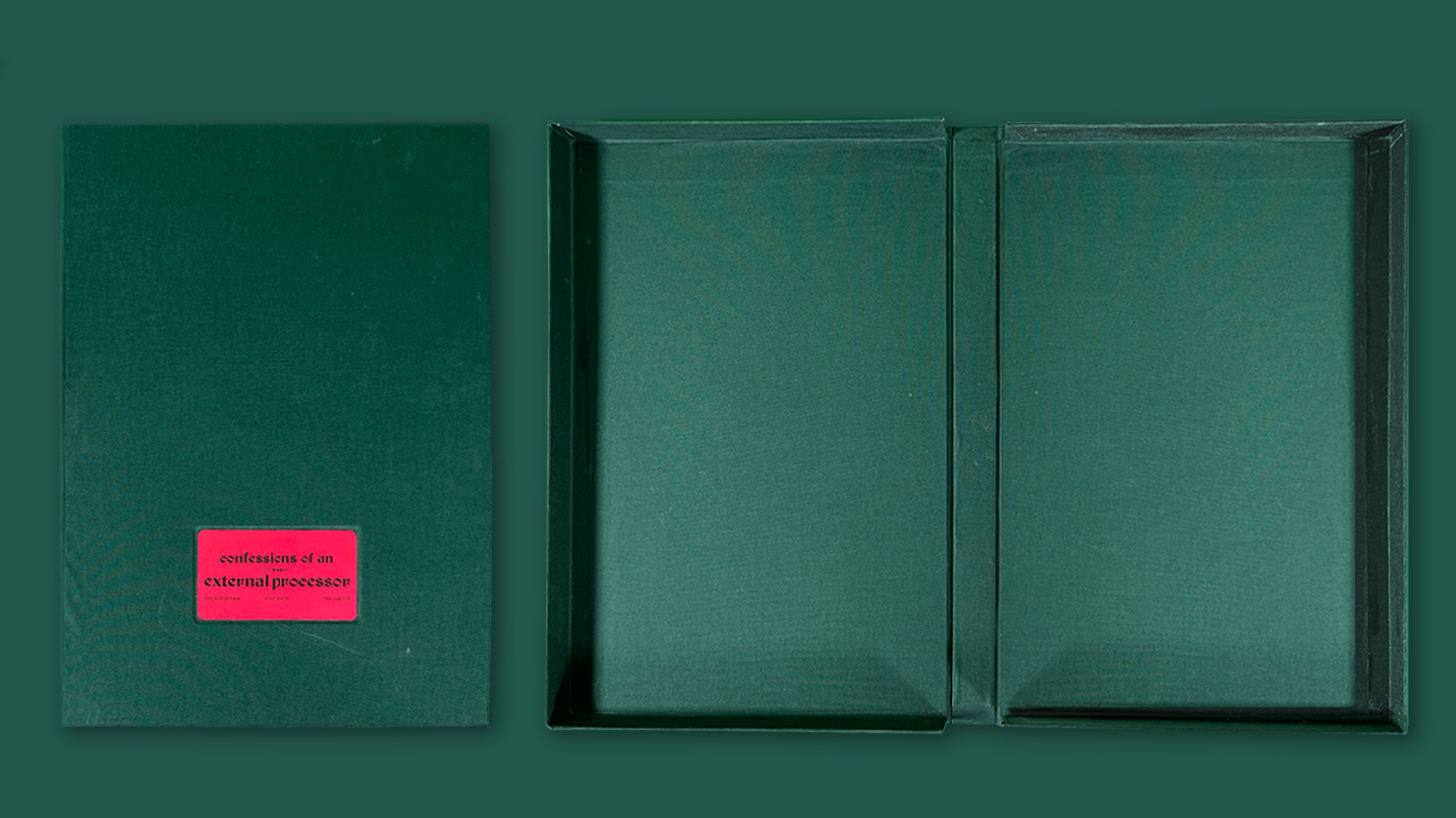
I chose to use a clamshell box design for the album package to create a tactile and dramatic presentation, reminiscent of a storybook opening. Adding an inlaid title card further enhanced the design with a touch of sophistication and class.

Full Package

Icon and Title Motion Graphic
Fall 2022
Cluck-Cluck Yeah!
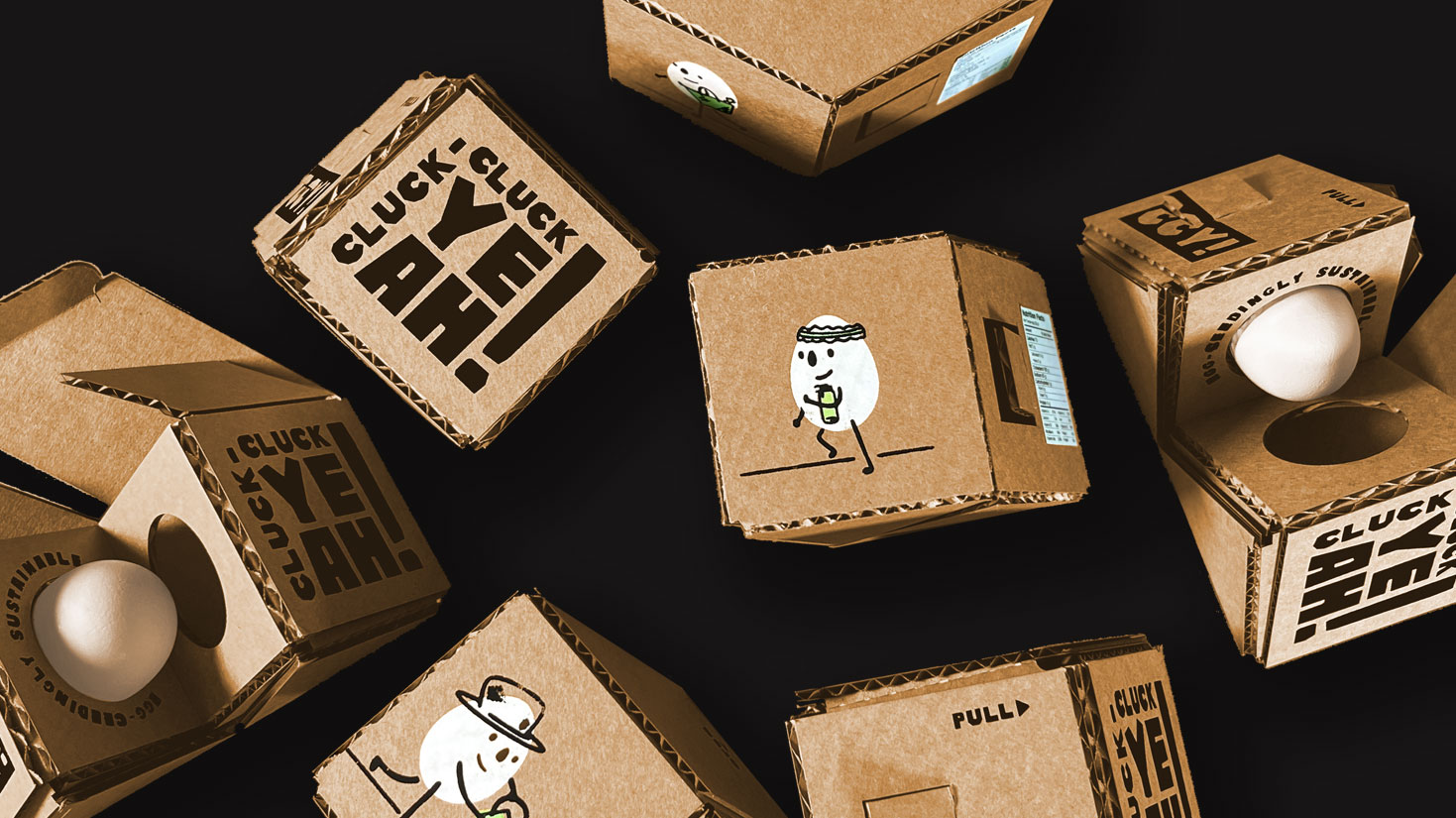
This modular, adhesive-free packaging solution for Cluck-Cluck Yeah!, a sustainability-focused concept company, was designed to reflect their needs and values of functionality and sustainability. The playful design features joyful illustrations and typography, while a cost-effective three-tone color palette captures the brand's ethical and handmade spirit.
Problem
Cluck-Cluck Yeah! is looking for a packaging solution that's sustainable, modular, and can protect a single egg from a 6-foot drop. Despite their relatively low budget, CCY requires an icon series that uses minimal colors and can be duplicated across the packaging system to create a fun and cohesive brand identity, without relying on excessive copy.
![]() The Cluck-Cluck Yeah! logo's playful, chunky typeface conveys a DIY, sustainable vibe, evoking the look of cut construction paper
The Cluck-Cluck Yeah! logo's playful, chunky typeface conveys a DIY, sustainable vibe, evoking the look of cut construction paper
Cluck-Cluck Yeah! is looking for a packaging solution that's sustainable, modular, and can protect a single egg from a 6-foot drop. Despite their relatively low budget, CCY requires an icon series that uses minimal colors and can be duplicated across the packaging system to create a fun and cohesive brand identity, without relying on excessive copy.
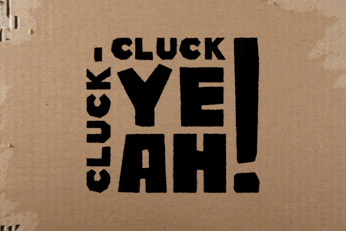 The Cluck-Cluck Yeah! logo's playful, chunky typeface conveys a DIY, sustainable vibe, evoking the look of cut construction paper
Solution
a diamond-shaped package that suspends the egg in the middle for all-around protection. The package is 100% adhesive-free, and can be connected to form a half-dozen pack through little side slots. The icon system features egg characters engaging in sustainable DIY activities that egg-celently embody the Cluck-Cluck Yeah! brand.
![]() The egg is suspended in the middle of the package, providing protection from all angles and ensuring it stays intact even if the package is dropped.
The egg is suspended in the middle of the package, providing protection from all angles and ensuring it stays intact even if the package is dropped.
a diamond-shaped package that suspends the egg in the middle for all-around protection. The package is 100% adhesive-free, and can be connected to form a half-dozen pack through little side slots. The icon system features egg characters engaging in sustainable DIY activities that egg-celently embody the Cluck-Cluck Yeah! brand.
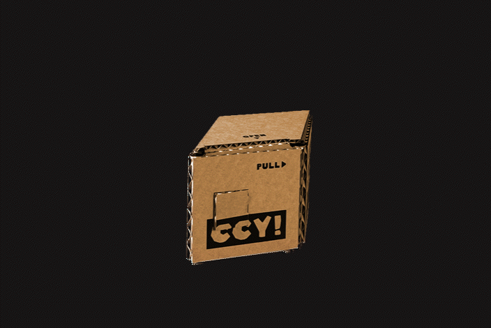
The package opens to reveal the egg in a playful and visually engaging way, adding an element of fun to the unboxing experience.


Dieline
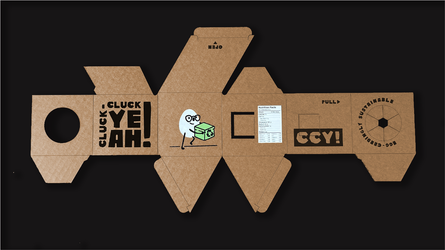
After experimenting with material thickness and folding methods, I developed a dieline solution that takes advantage of the corrugation of the cardboard. The design can be duplicated diagonally three times on a single 32"x18" sheet, with fold lines cut 2/3 of the way through to maintain structural integrity while folding. This solution meets design goals and ensures durability during full of six feet or less.
Modular Solution
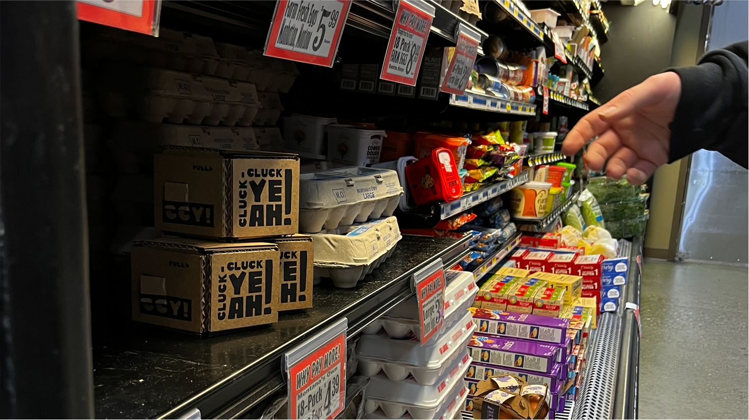
The modular packaging solution I designed features a unique joining method that connects the packages with simple slits on the sides. When six packages are put together, they form a star shape, creating a visually striking display that stands out on store shelves. This joining method not only adds to the aesthetic appeal of the packaging but also makes assembly quick and easy, streamlining the packaging process and reducing production costs.
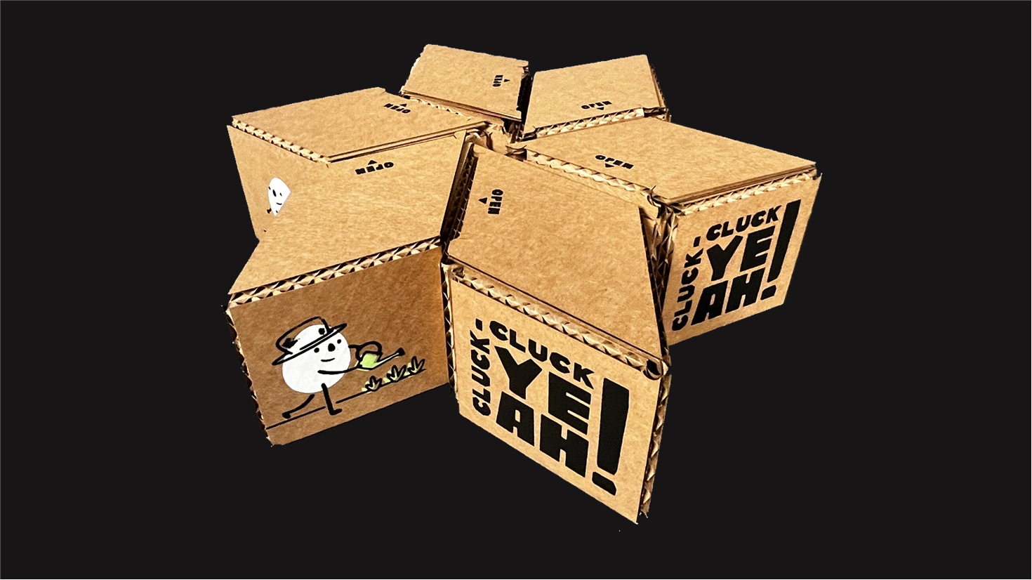
Modular Solution
Spring 2023
Zenyum Invisible Braces
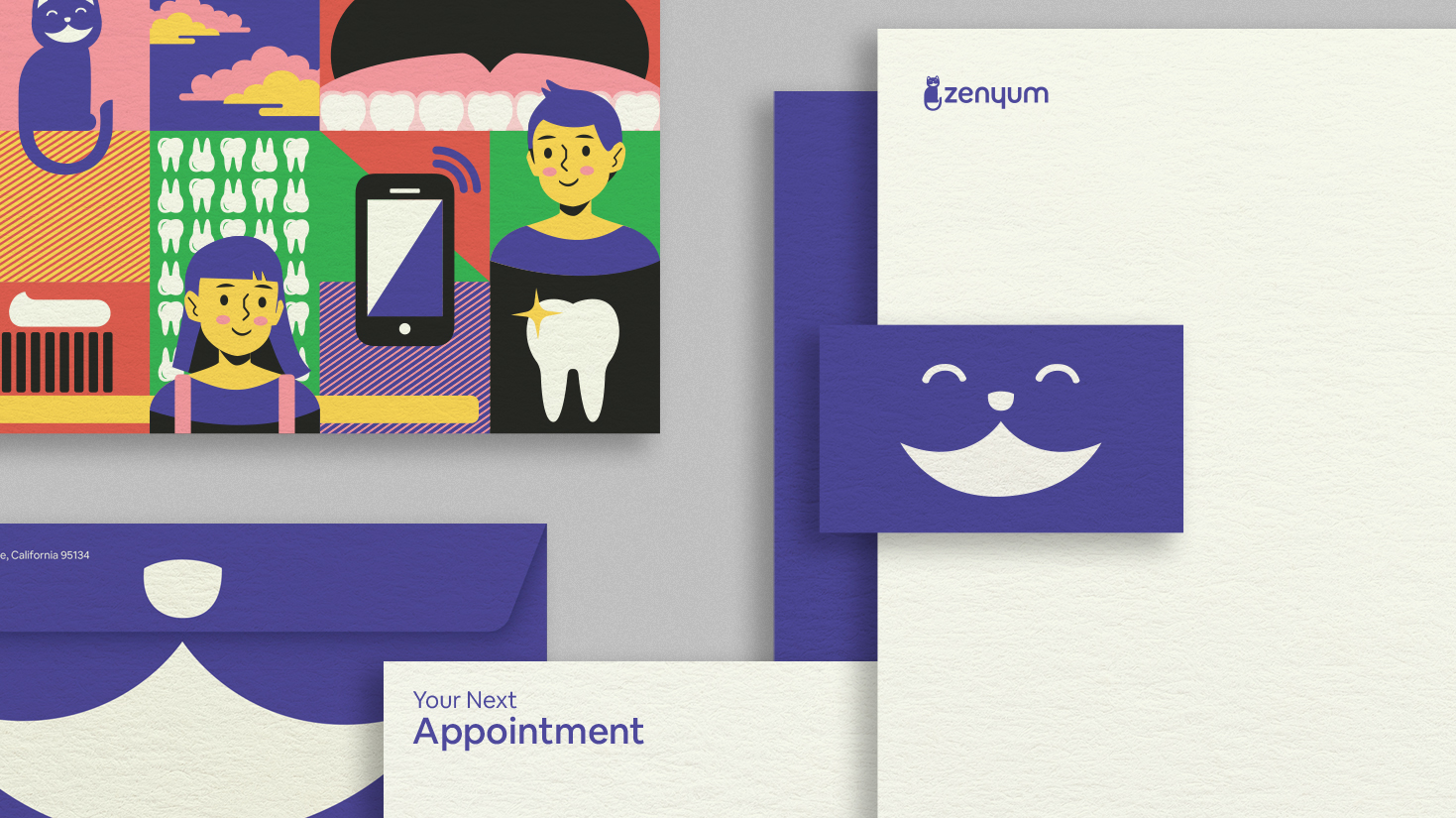
Zenyum is an invisible braces company in Southeast Asia that uses 3D printing to create custom braces. I took a whimsical approach to creating their visual identity, featuring a smiling cat logo inspired by the Cheshire Cat from Alice in Wonderland. The extended brand elements use a funky color palette, simple vector illustrations, and thoughtful typography to bridge the gap between fun and trustworthiness. The goal was to create a visually appealing brand identity that appeals to Zenyum's target demographic while communicating the company's expertise and professionalism
The Cheshire Cat, with its iconic smile and ability to disappear, makes for an excellent logo icon for an invisible braces company. This custom icon and word mark is a fun and playful choice that sets it apart from competitors in the market. With its bold color palette and clean typography, the logo catches the eye and leaves a memorable impression.

Full Stationery Set
Letterhead
Appointment Card
Envelope
Business Card
Letterhead
Appointment Card
Envelope
Business Card
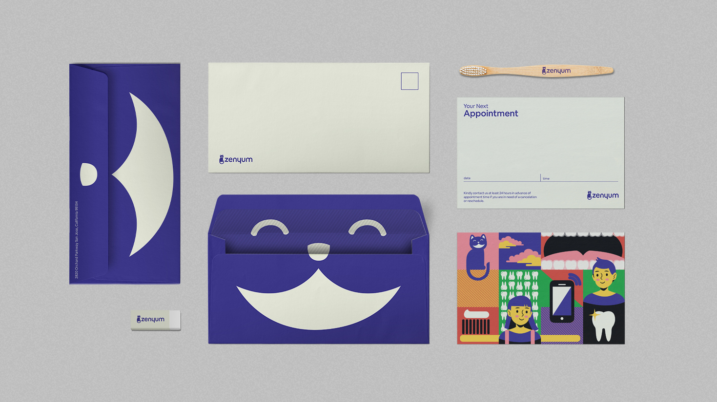
When designing the stationery system for Zenyum, my goal was to strike a balance between whimsy and professionalism. I wanted to create an experience that would help ease any anxieties associated with going to the dentist. To achieve this, I drew inspiration from the joyfulness of Louise Carrol's Alice in Wonderland, infusing a touch of magic into the branding.
The appointment card, in particular, embodies this playful spirit, while the envelope features a peek-a-boo flap that adds a touch of sweetness. Throughout the design, I opted for a sparse and thoughtful use of typography. This helped to ground the bold branding and ensure that it wouldn't be overwhelming for the viewer."
The appointment card, in particular, embodies this playful spirit, while the envelope features a peek-a-boo flap that adds a touch of sweetness. Throughout the design, I opted for a sparse and thoughtful use of typography. This helped to ground the bold branding and ensure that it wouldn't be overwhelming for the viewer."
Stationery Closeup featuring letterhead, appointment card, envelope, and business card

Cat Illustrations
To further emphasize the playful spirit of Zenyum, I decided to expand the logo icon into a family of playful cat characters. These delightful Cheshire illustrations can be used throughout the branding to inject character and intrigue. With their whimsical charm and mischievous grins, these feline companions are sure to bring a smile to the customers' faces. Moreover, they play a key role in establishing a unique and memorable brand identity.
To further emphasize the playful spirit of Zenyum, I decided to expand the logo icon into a family of playful cat characters. These delightful Cheshire illustrations can be used throughout the branding to inject character and intrigue. With their whimsical charm and mischievous grins, these feline companions are sure to bring a smile to the customers' faces. Moreover, they play a key role in establishing a unique and memorable brand identity.
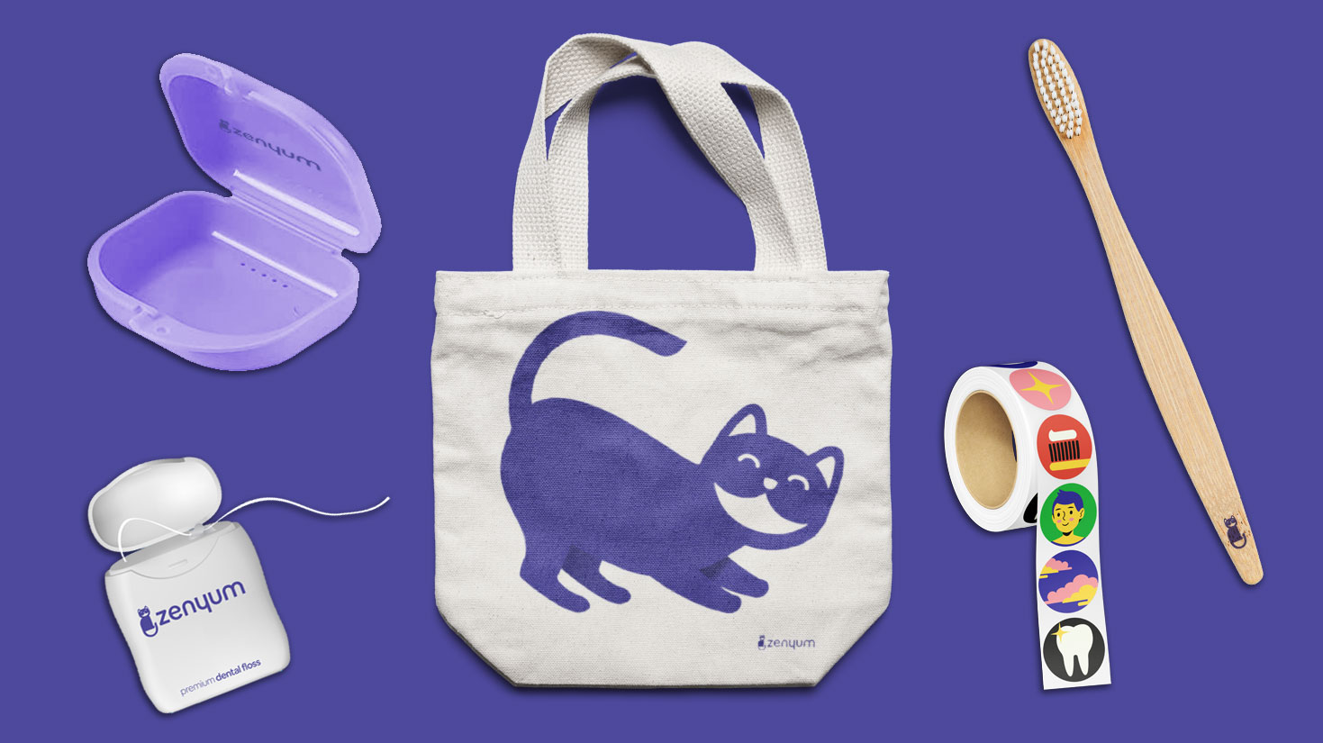
Brand Extension Concepts including retainer case, floss package, tote bag, sticker wheel, and bamboo toothbrush
 Home, Process, and Appointment Scheduling Web Pages
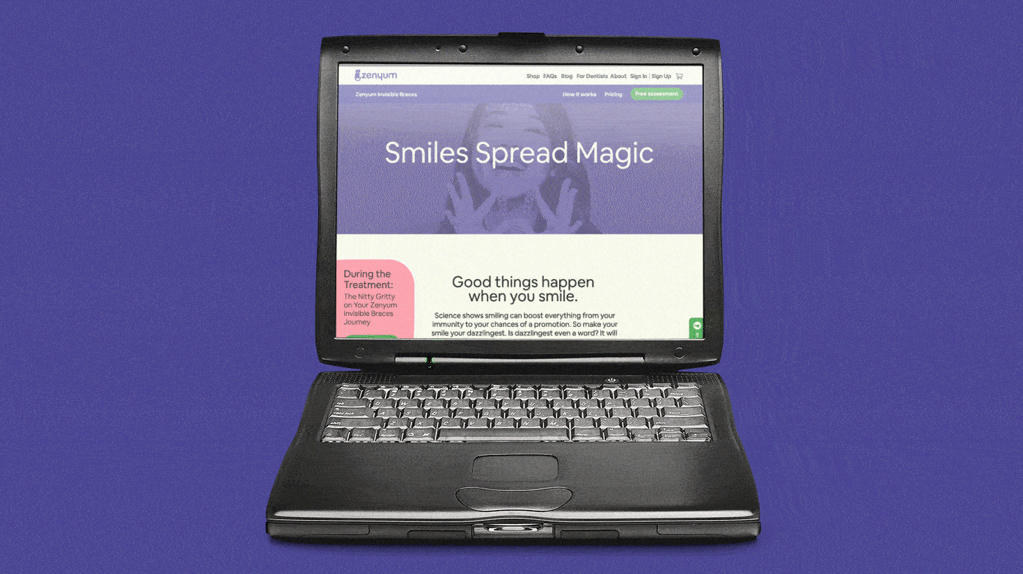 Home, Process, and Appointment Scheduling Scrolling Visual
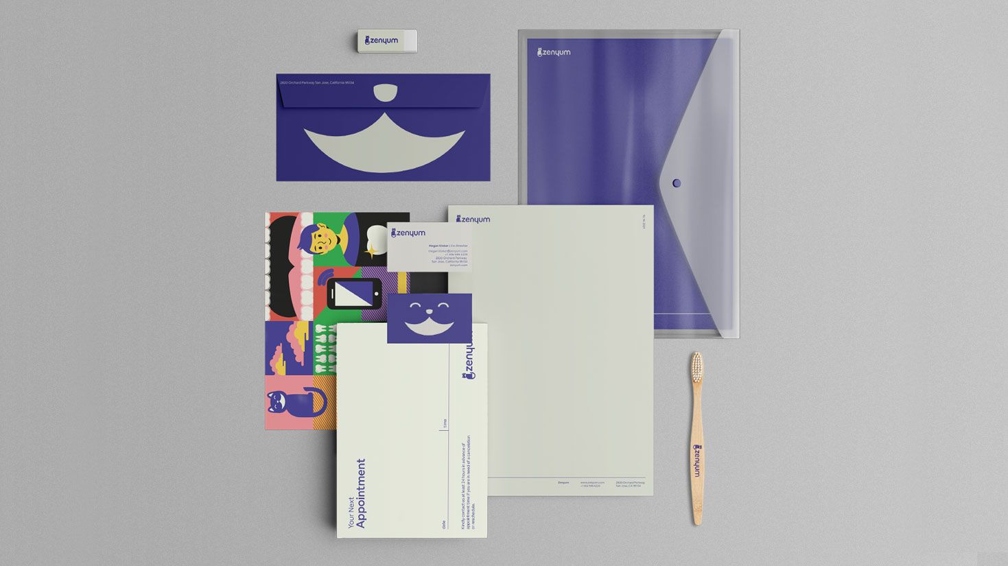
Full Stationery Set
Fall 2021
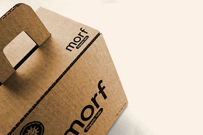
Morf Organic Tofu
Morf Organic Tofu is a playful and unconventional brand that aims to breathe new life into the world of tofu packaging. Each type of tofu is represented by a unique character hybrid inspired by mythological creatures and accompanied by a story that invites the consumer on a culinary adventure. The variety pack encourages experimentation and creativity, allowing customers to stack individual packages and create a custom character. Morf is a brand that combines beauty and functionality, playfulness and quality, inspiring a love for plant-based foods.
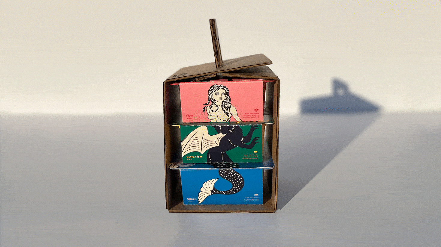
Morf Variety Pack
Screen Printed Carrying Case
Custom Dieline
Individual Tofu Packages
Screen Printed Carrying Case
Custom Dieline
Individual Tofu Packages
The Morf Organic Tofu variety pack includes a playful carrying case that is sure to bring joy and excitement to the user. Inspired by the whimsy of a Happy Meal, it invites the inner child to explore and experiment with each tofu type. Not only does it offer a great way to store and transport the tofu, but it also provides a fun vantage point for playing with the stacking of the boxes to create unique creatures. Our goal is to make discovering the wonderful world of tofu as enjoyable and engaging as possible.


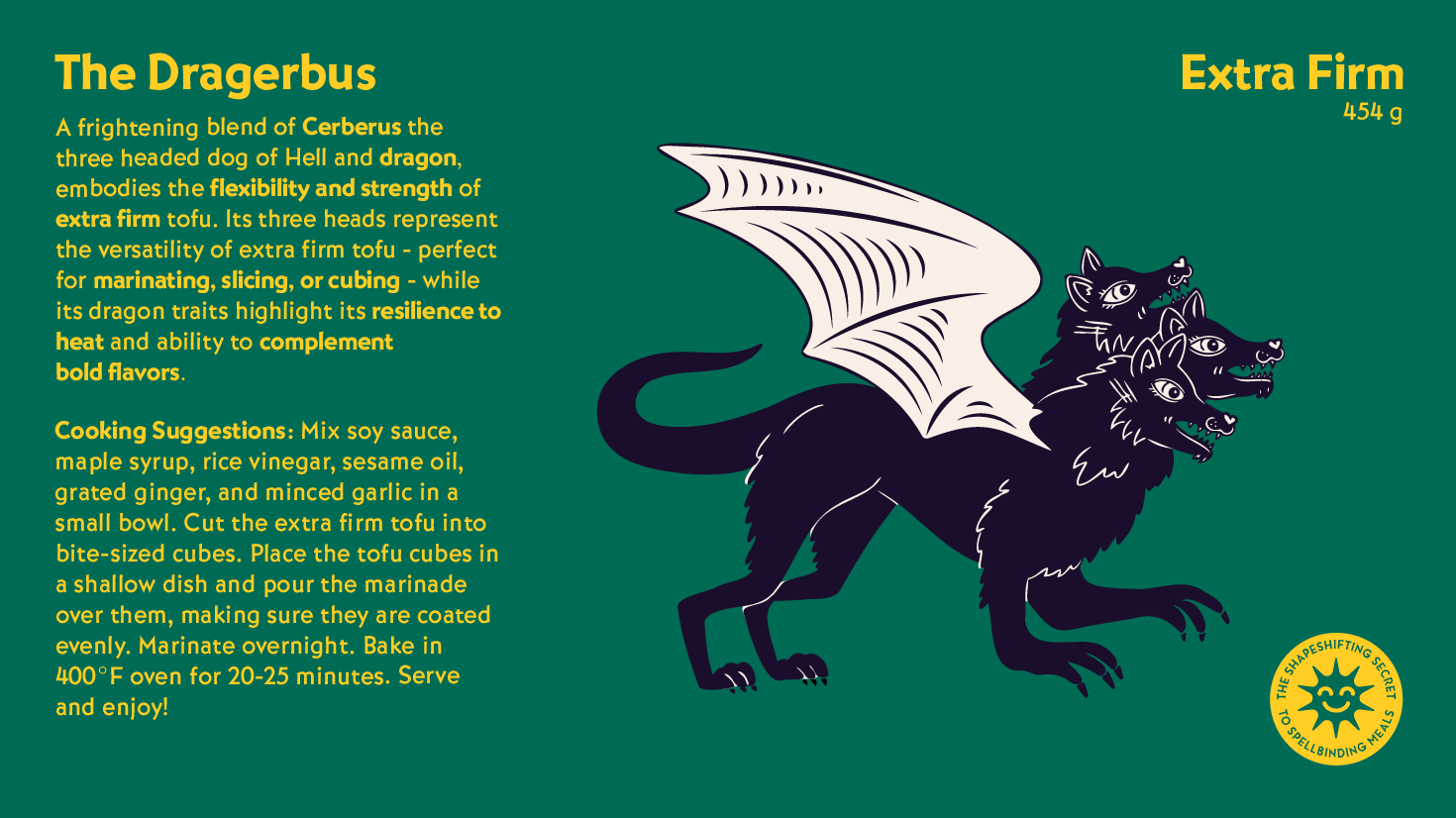
Character Descriptions, cooking suggestions and illustration.
Morf Logo color variations
Slogan, vegan certification, gluten-free certification, heart-healthy certification, protein, recyclability, and non-GMO soybeans certification—these are the icons that represent important aspects of the product.


Click to scroll through the carousel and explore the tofu sleeve dielines for Silken, Firm, and Extra Firm variations.
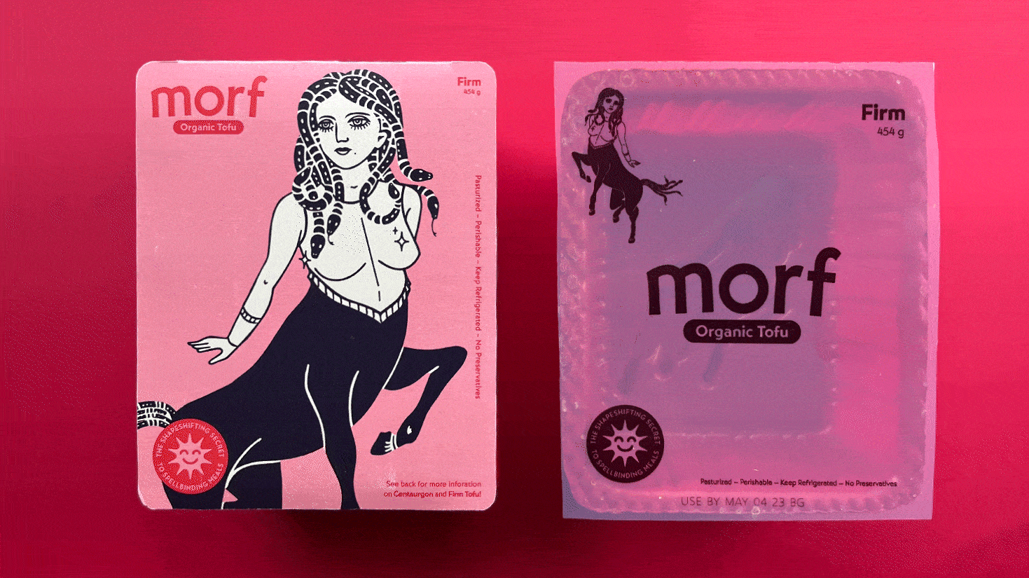
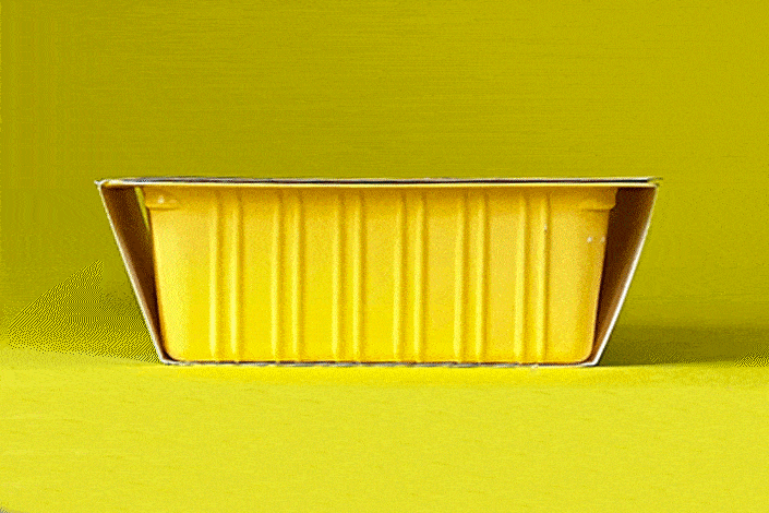
Firm Tofu
Front of Sleeve
Vacuformed Tofu Tray
Plastic Tray Covering
Front of Sleeve
Vacuformed Tofu Tray
Plastic Tray Covering
Vacuum forming, is a manufacturing process that involves heating a thermoplastic sheet and shaping it into a desired form using a vacuum. The process begins by heating a sheet of plastic until it becomes pliable. The sheet is then clamped onto a mold as a vacuum is applied to the underside, sucking the plastic down to create a desired shape. Once the plastic cools and hardens, it can be removed from the mold and trimmed.
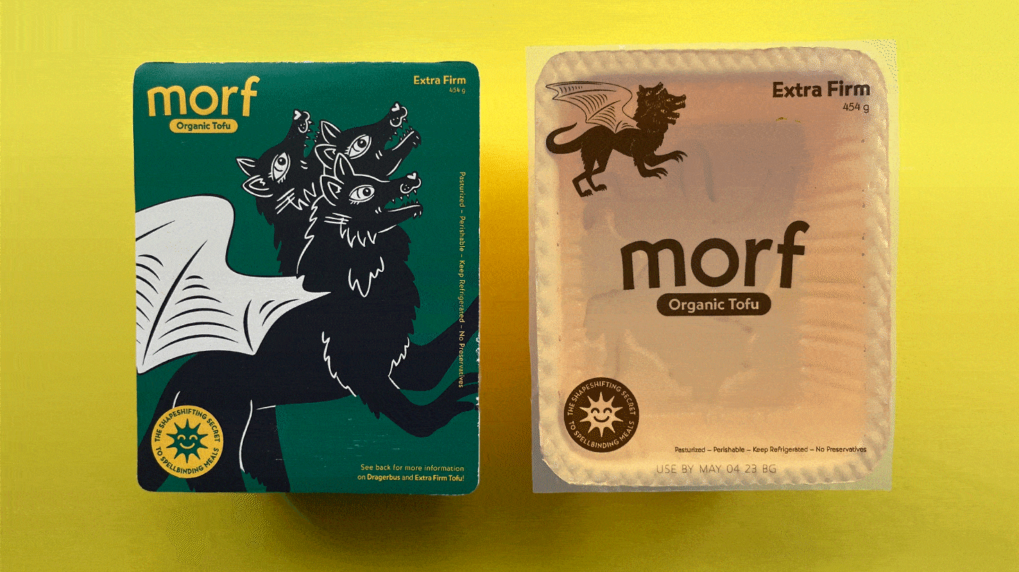
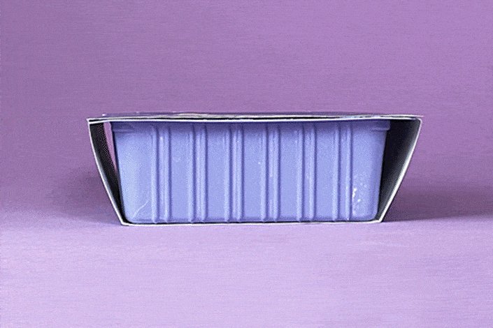
Extra Firm Tofu
Front of Sleeve
Vacuformed Tofu Tray
Plastic Tray Covering
Front of Sleeve
Vacuformed Tofu Tray
Plastic Tray Covering
To create the trays for Morf Tofu, I utilized a vacuform machine. First, I created acrylic character silhouette using a laser cutter. Then, I took a plaster mold of a tofu tray, placed the character silhouettes on top of the plaster mold, covered the form with a clear sheet of plastic and ran it all through a a vacuformer. The process allowed me to achieve a unique and customized look for each tofu type.
To get the trays to match the color palette of each package, I used a couple coats of rustoleum spray paint on the insides and outside of the trays.
To get the trays to match the color palette of each package, I used a couple coats of rustoleum spray paint on the insides and outside of the trays.
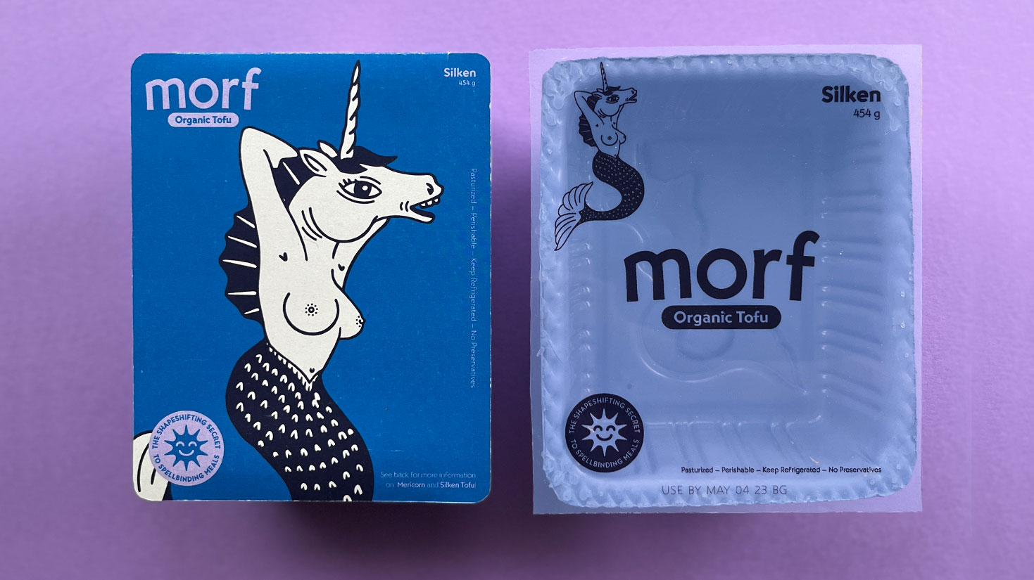

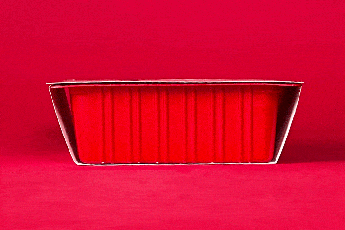
Front of sleeve, vacuformed tofu tray , plastic tray covering for Silken Tofu
Tofu Package Stacking Demo
 Tofu Package sides
Taking inspiration from the drawing game “exquisit corpse” and how tofu is shelved in stores, I designed the Morf Tofu packages to stack. Two sides of each package feature a unique character component (head, torso, tail, legs, ect.). When stacked, the packages combine to create the appearance of a new hybrid creature. By allowing the user to experiment and create their own unique hybrid character, I aim to showcase tofu's transformative power
and versatility.

I used bold colors and linocut-style illustrations on the tofu packaging to help customers easily identify the different types. The consistent design makes stacking simple and prevents confusion.
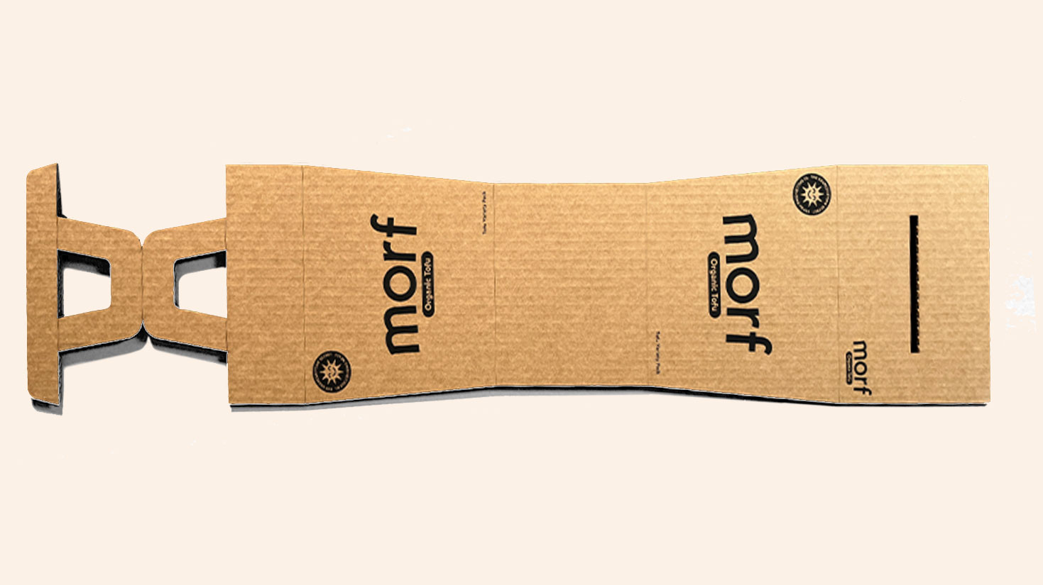

Variety Package Dieline and Detail Shot //
For the Morf Tofu variety pack, I created a custom dieline made of sturdy cardboard. The design was laser cut and then screen printed with the logo, slogan, and descriptor. The goal was to make the packaging feel both artisanal and robust. The dieline was engineered to allow for secure opening and closing without the need for glue, making it both user-friendly and eco-friendly. The resulting packaging not only showcases the unique character designs of each tofu type but also reinforces Morf's commitment to sustainability and thoughtful design.
For the Morf Tofu variety pack, I created a custom dieline made of sturdy cardboard. The design was laser cut and then screen printed with the logo, slogan, and descriptor. The goal was to make the packaging feel both artisanal and robust. The dieline was engineered to allow for secure opening and closing without the need for glue, making it both user-friendly and eco-friendly. The resulting packaging not only showcases the unique character designs of each tofu type but also reinforces Morf's commitment to sustainability and thoughtful design.
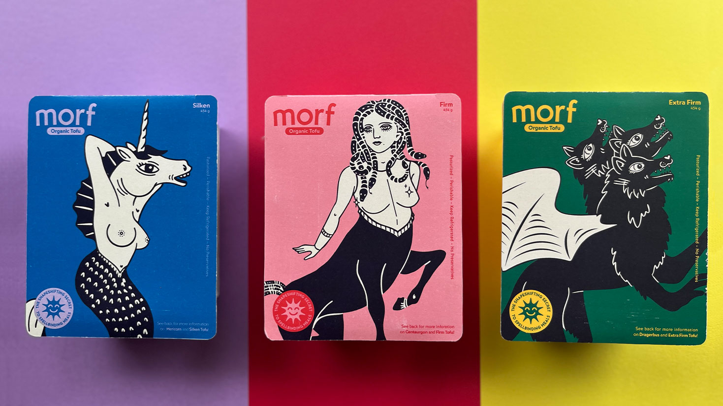

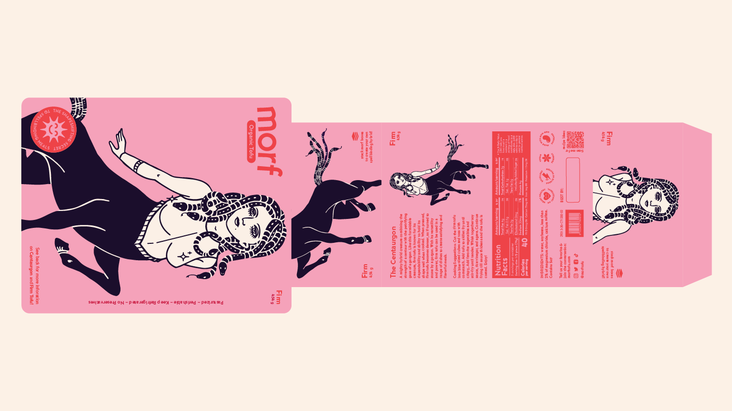
The Morf Tofu package is designed with both the front and back in mind. On the front, a large-scale version of the character is showcased along with the logo, slogan, and tofu type name. The bold and eye-catching design draws the consumer's attention and provides them with an immediate understanding of the product. On the back of the package, a smaller version of the character is featured alongside the character description and nutrition information. This design allows the consumer to learn more about the tofu type, its characteristics, and nutritional value. Overall, the package design is crafted to be both visually appealing and informative for the consumer.

Store Shelf Concept
The packages could either be purchased as individuals or as a variety pack.
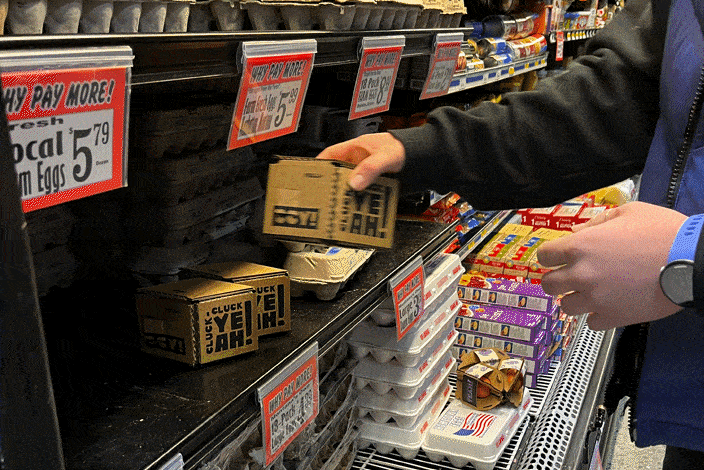
Reverse Shoplifting Project
The reverse shoplifting project involves creating a product that can be sold in stores, but with a twist: instead of taking it from the store, the designer leaves it there without paying for it to see if people are interested enough to engage with it and potentially take it home. It's a social experiment that challenges traditional notions of ownership, consumerism, and retail shopping.
The packages could either be purchased as individuals or as a variety pack.
Reverse Shoplifting Project
The reverse shoplifting project involves creating a product that can be sold in stores, but with a twist: instead of taking it from the store, the designer leaves it there without paying for it to see if people are interested enough to engage with it and potentially take it home. It's a social experiment that challenges traditional notions of ownership, consumerism, and retail shopping.

Tofu Packages and Variety Pack Carrying Case
Spring 2023
New Moon Title Sequence
Inspired by the iconic Twilight saga, my animated title sequence captures film aesthetic, thematic trends, and story elements through carefully curated scene selection, color palette, and dark folk music.

The name “Red Eye Creative Media and Production Co.” pays tribute to the signature blood-red eyes of the antagonists of the Twilight saga. It also alludes to a high stakes scenes in which characters take an overnight flight to Italy.

To capture more complex moments of movement such as the wolf’s walking cycle and the liquid transition of the eye icon in the logo animation, frame by frame animation was used to simplify the process.
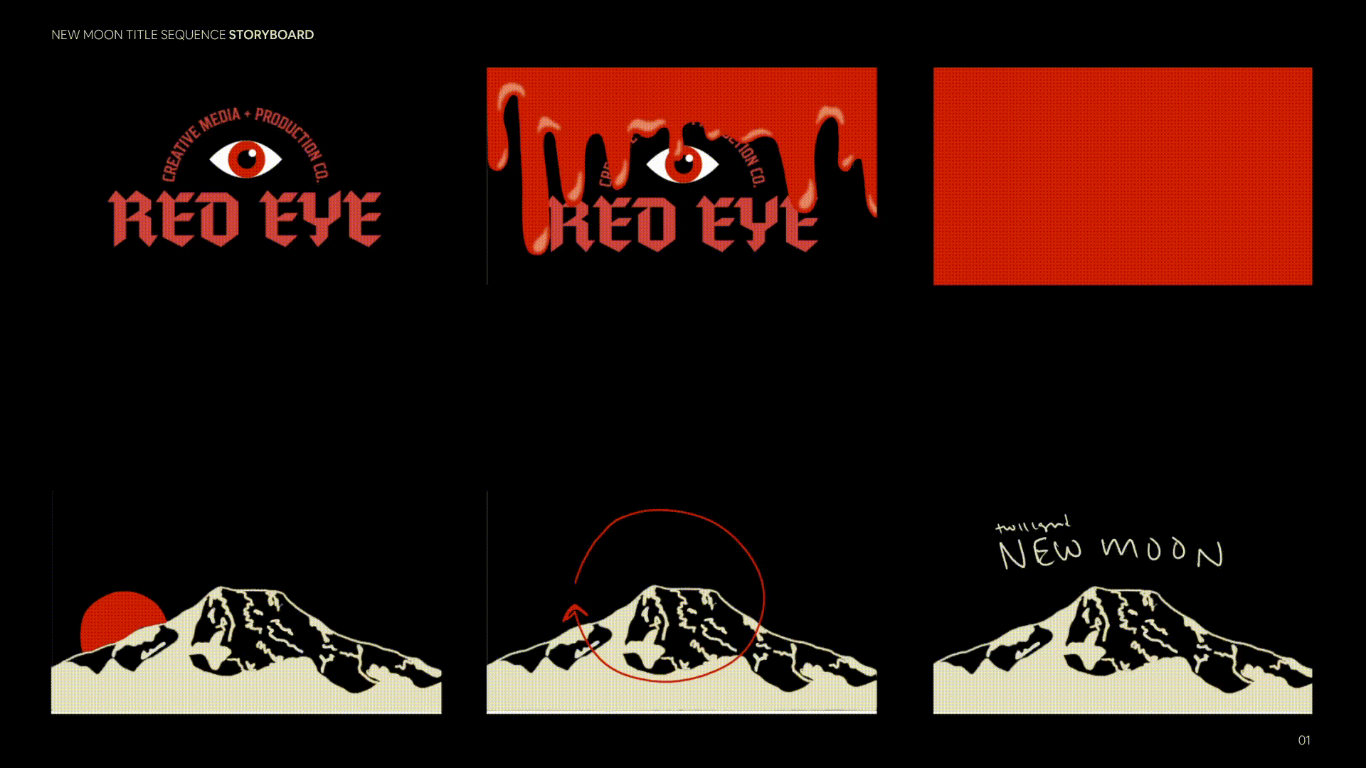
Storyboard
Spring 2022