Confessions of an External Processor
Confessions of an External Processor,
the debut EP by singer-songwriter Sally Duhon, explores the emotional difficulties of growing up, missing out on love, confronting family trauma, and learning self acceptance. To visually represent the contrasting lyrical and sonic qualities of the songs, the album package utilizes duality. Earthy tones interrupted by bold red, sharp black letter outlined in florals, tongue in cheek illustrations referencing pain. Together, these elements create a striking representation of the raw emotion conveyed in Duhon’s music.
Research Methods
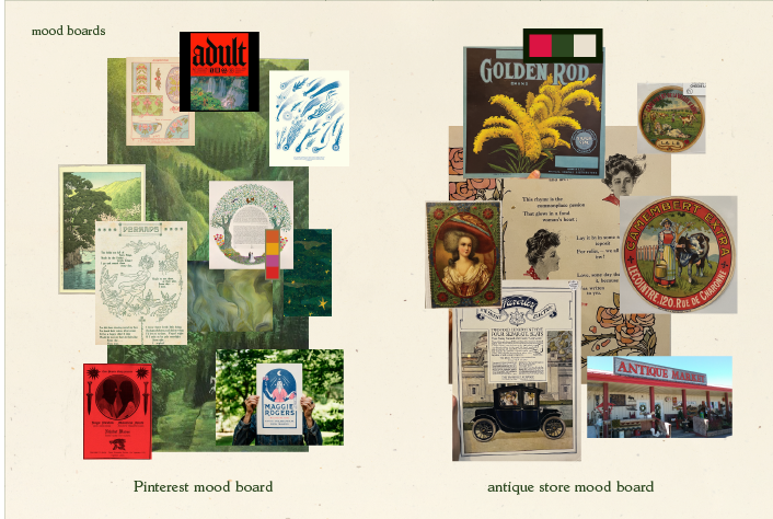
Through directed story telling, I learned that fans appreciate merch that looks cool objectively but gains greater relevance in the context of the music. With moodboarding, I explored different styles I could approach the project through. I created concepts using both internet sources and scanned images from local antique stores.
Illustrated Motifs
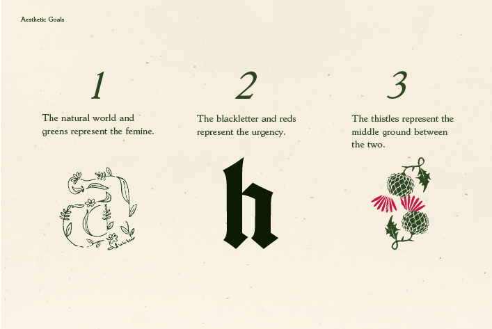
The natural world and greens represent the feminine, blackletter and reds represent urgency, and the thistles and flower type outline represent the middle ground between the two.
Album Logo
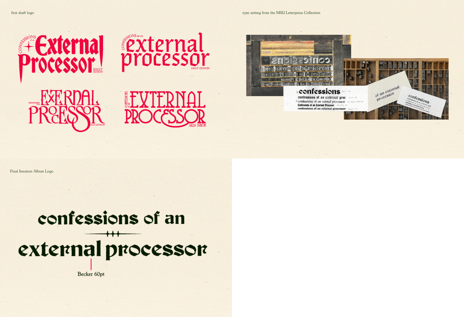
The album logo came through iterations and simplification, using the MSU type collection and an abstracted thistle leaf. The result is a timeless, romantic, and melancholy word mark.
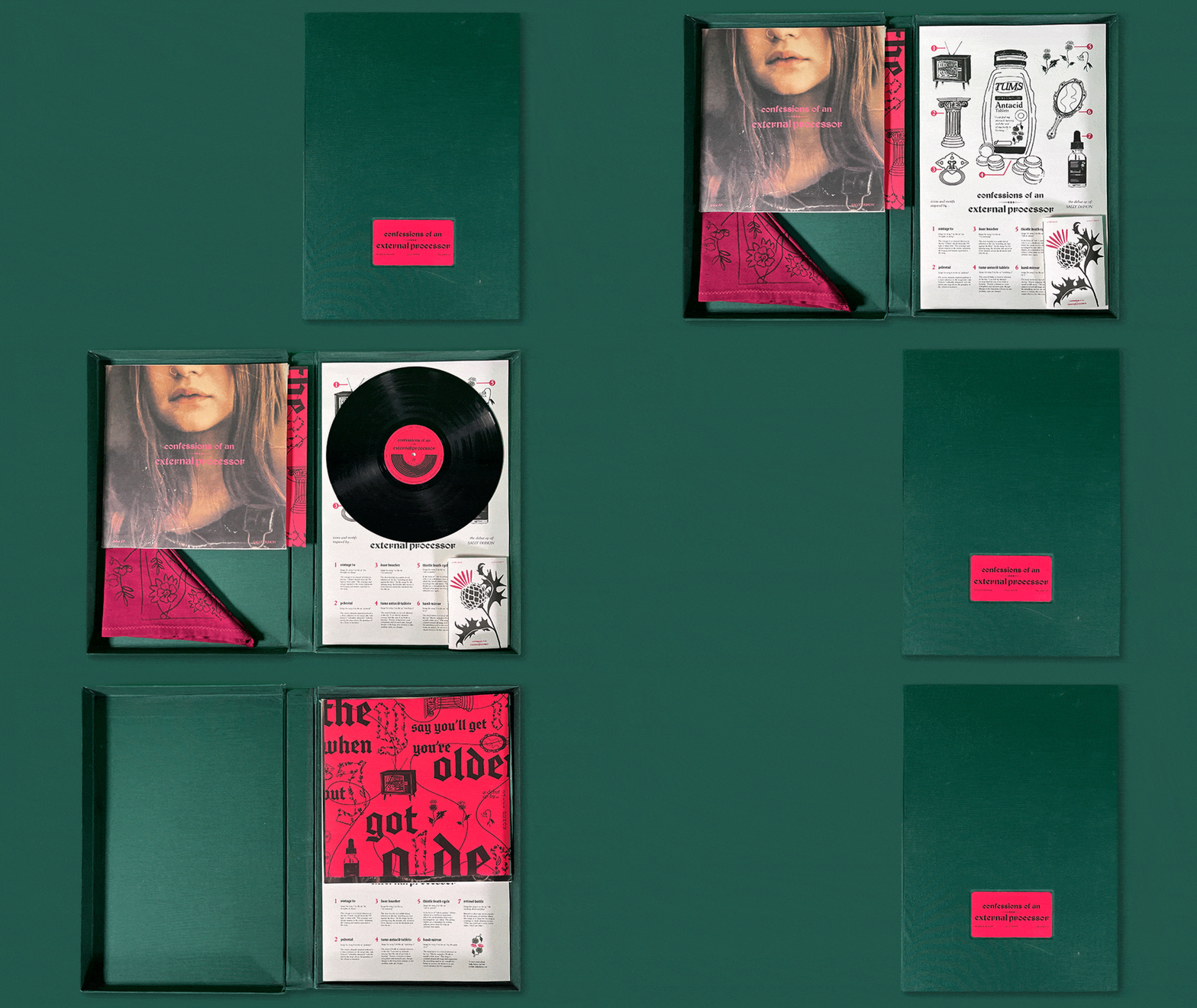
 The Full Album Package consists of a Clamshell Box, Bandana, Lyric Zine, Album Cover, Sleeve, Vinyl, and Poster
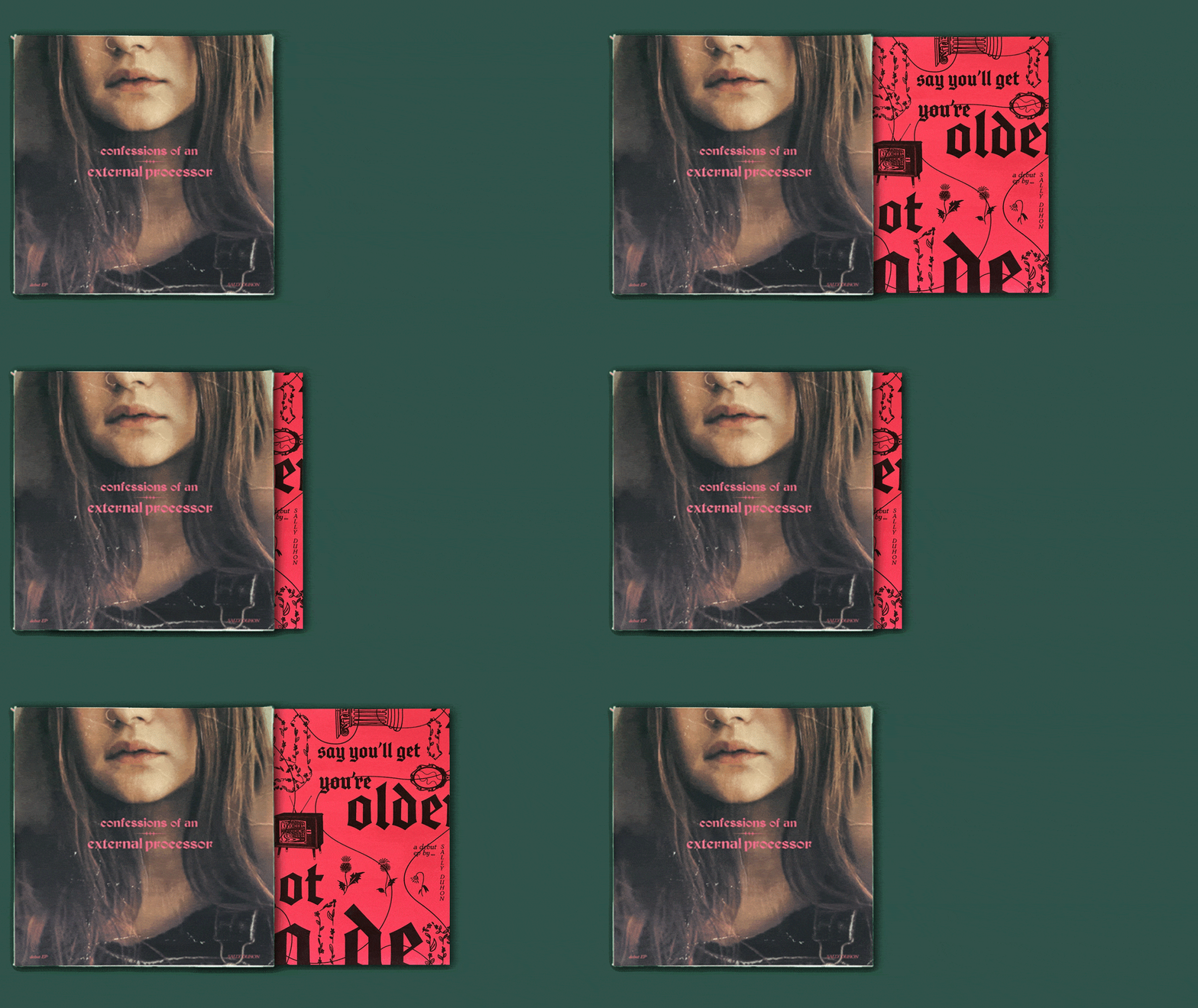
Album Front, Sleeve, and Vinyl

Album Front and Back
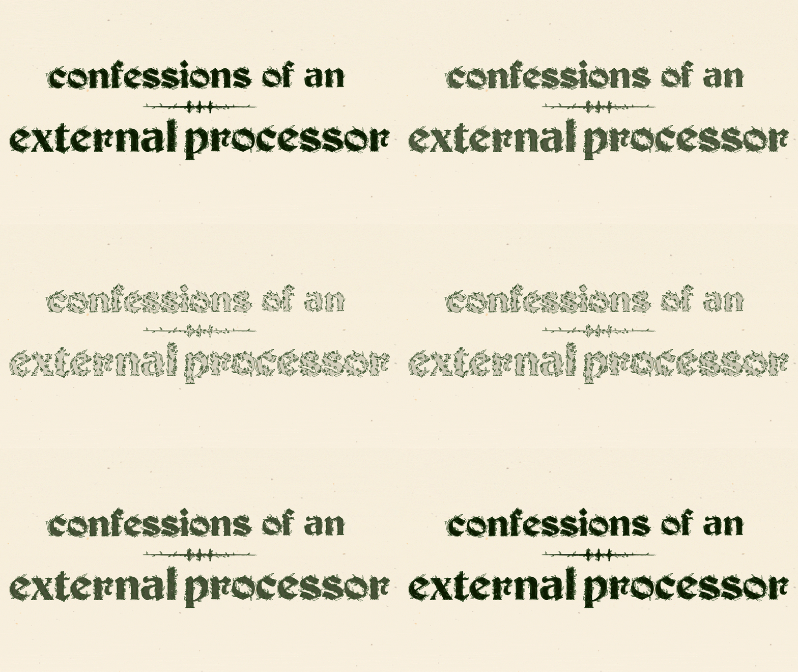
The EP's contrasting elements of gentle lyricism and urgent instrumentation are emphasized on the back of the album, where the black letter logo from the front is featured but with a floral outline. This design choice not only complements the overall visual style of the album, but also accentuates its emotional duality.
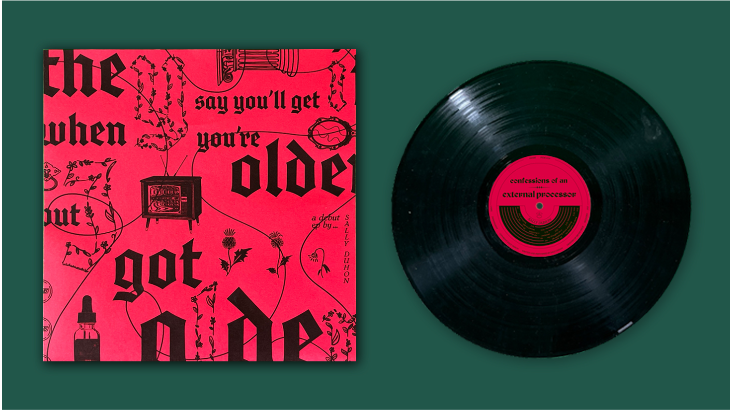
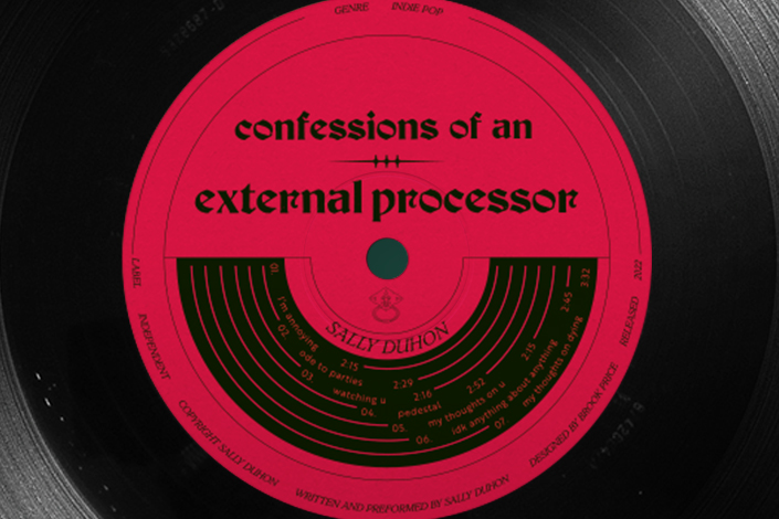
Sleeve and Vinyl
The sleeve and record label contrast the cover. They are loud, red, and loaded with symbolism from the album. The floral outlined letters on the sleeve ensure that the contrast between it and cover are not too harsh. They demonstrate the coexistence of vulnerability and boldness. As a unit, the sleeve, record label and album cover embody the duality of the music. Soft and hard, bold and subtle.

Drawing inspiration from the religious connotations of "confessions," The Lyric Zine's layout mimics a church hymnal. Each song is accompanied by an original illustration referencing a poignant lyric. For instance, a door knocker represents "I'm annoying," wilting thistles symbolize "ode to parties," a hand mirror signifies "my thoughts on you," and an old school TV with eerie static embodies "my thoughts on dying." These visual cues enrich the EP's evocative lyrics with additional layers of meaning.
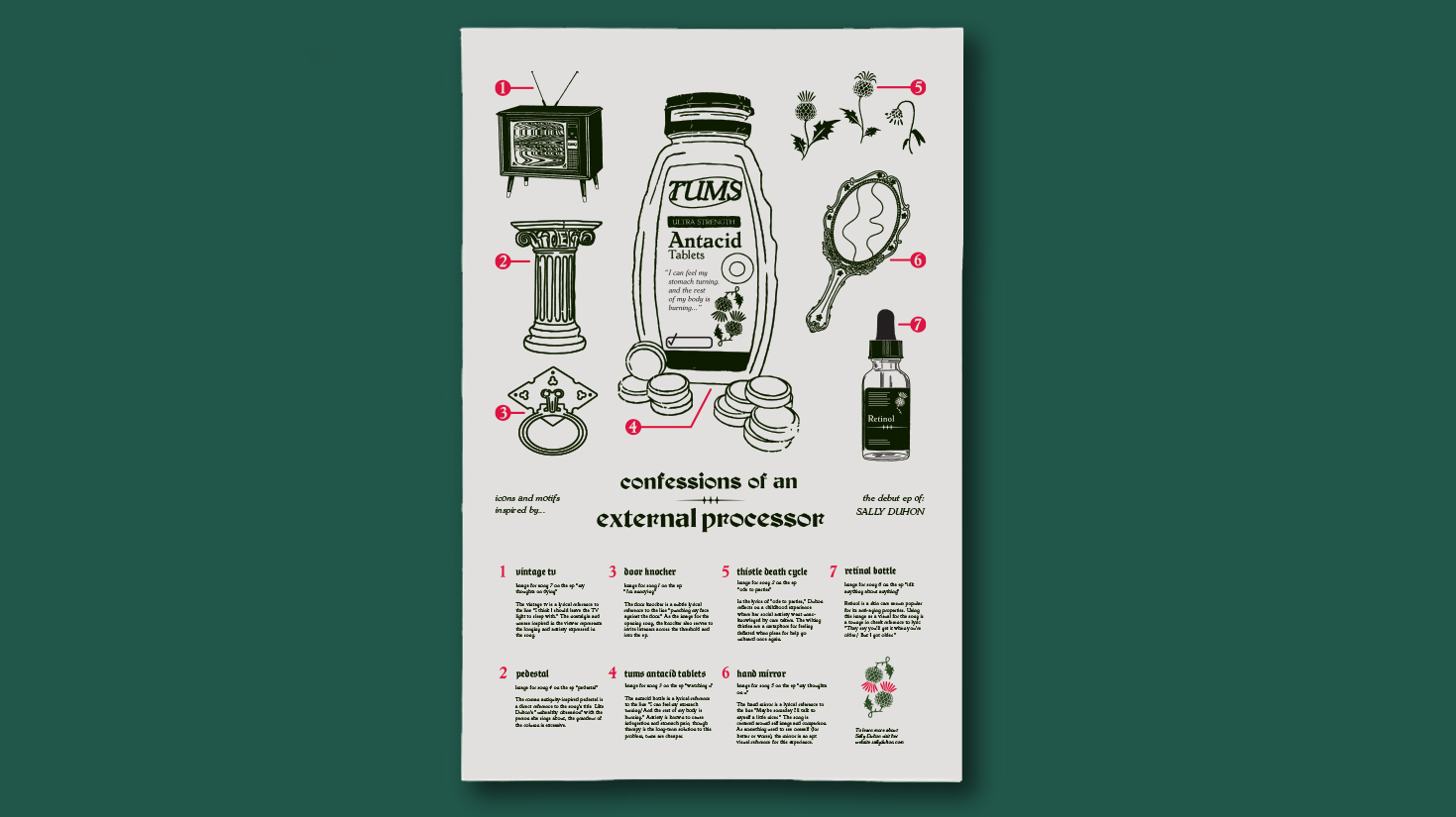
The Poster explains the illustrated motifs from Sleeve and Lyric Zine.
![]() Illustrated Motifs
Illustrated Motifs
The door knocker illustration for the opening track of the EP, "i'm annoying," serves as an invitation for listeners to enter Duhon's story.
The thistle death cycle illustration for "ode to parties," the second track on the EP, represents feeling deflated when pleas for help go unheard.
The Tums bottle illustration symbolizes the stomach pain caused by anxiety as depicted in the third track of the EP, "watching u."
The ornate pedestal illustration for the EP's fourth track, “pedestal,” reflects Duhon's "unhealthy obsession" with the person she sings about.
The delicate hand mirror illustration relates to the central theme of self-image and comparison in the Ep’s fifth track, "my thoughts on u."
The retinol bottle illustration for the EP’s sixth track, "idk anything about anything," playfully alludes to the fear of getting older.
The vintage TV illustration serves as a symbol of the unease and nostalgia portrayed in seventh and final track on the EP "my thoughts on dying."
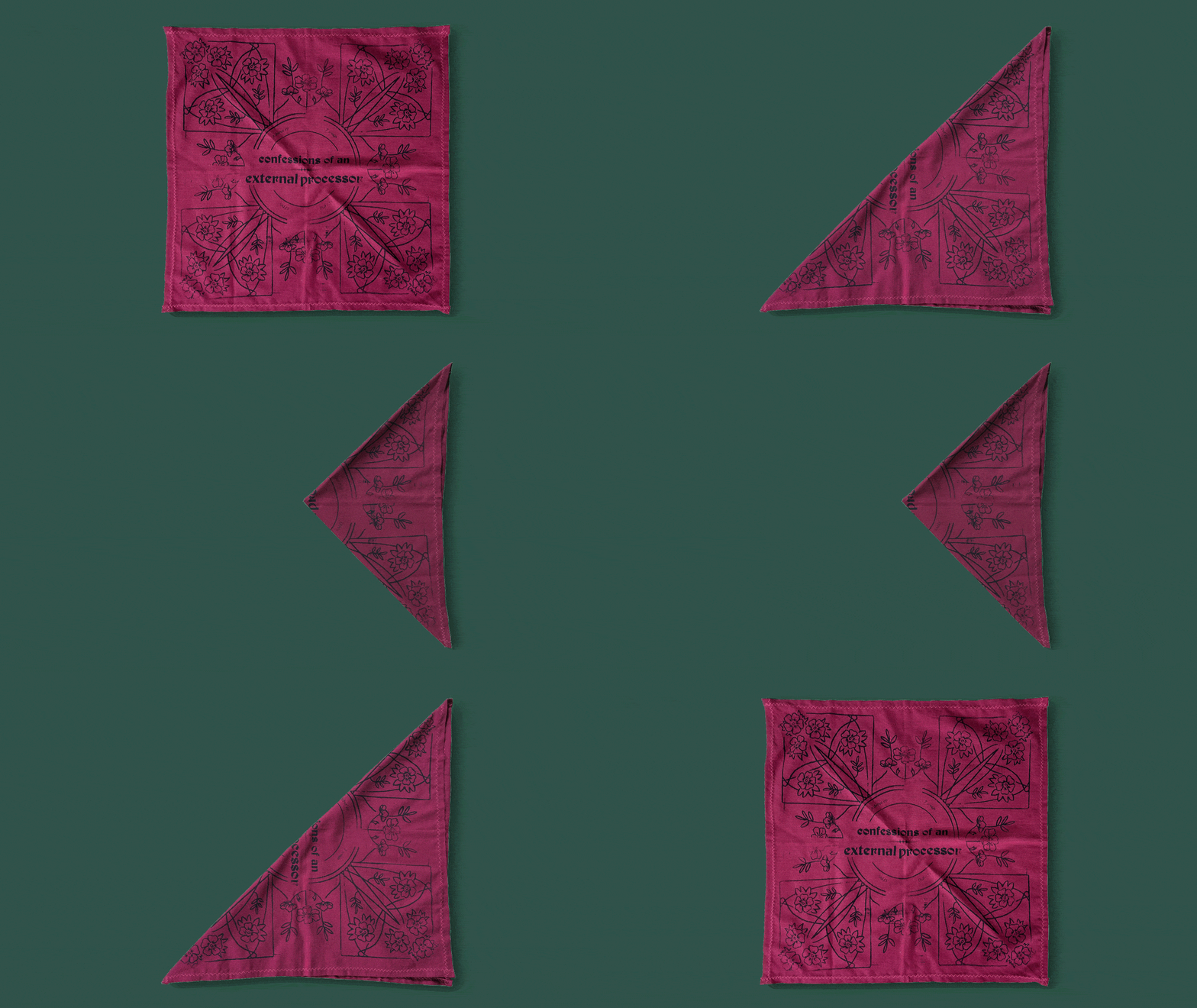 The screen-printed bandana showcases a floral pattern that echoes the floral logo on the album cover, adding a cohesive visual element. Additionally, it serves as a practical accessory, perfect for wiping away tears while listening to the EP.
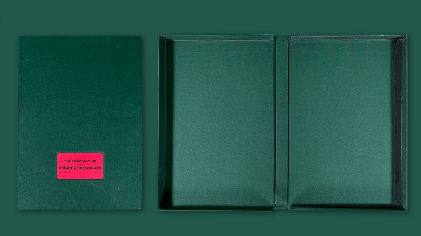
I chose to use a clamshell box design for the album package to create a tactile and dramatic presentation, reminiscent of a storybook opening. Adding an inlaid title card further enhanced the design with a touch of sophistication and class.

Full Package

Icon and Title Motion Graphic
Fall 2022


 Illustrated Motifs