graphic designer, multi-media artist, vegetable garden
Work
Design
Logos
Play
RISO Printing
Print Making
About
Contact
Resume

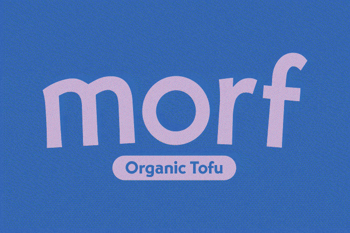
Morf Organic Tofu
Morf Organic Tofu is a playful and unconventional concept brand that aims to breathe new life into the world of tofu packaging. Each type of tofu, silken, firm, and extra firm, is represented by a unique character hybrid inspired by mythological creatures. The intention with this concept is to demystify the idea of cooking with tofu by leaning into absurdity and showcasing tofu’s versatility through visual metaphors and offbeat characters.
Project Scope
Brand Identity, Illustration, Packaging Design, Screen Printing, Dieline Development


Stacking
The company is called Morf to emphasize tofu’s ability to take different forms in different dishes. To visually represent this quality, I created a custom character for each tofu type (silken, firm, and extra firm) and laid them out so that their side panels are stackable. The idea here is for consumers to experiment with stacking to create different character hybrids and, in doing so, get excited to try out the tofu itself.


