graphic designer, multi-media artist, vegetable garden
Work
Design
Logos
Play
RISO Printing
Print Making
About
Contact
Resume
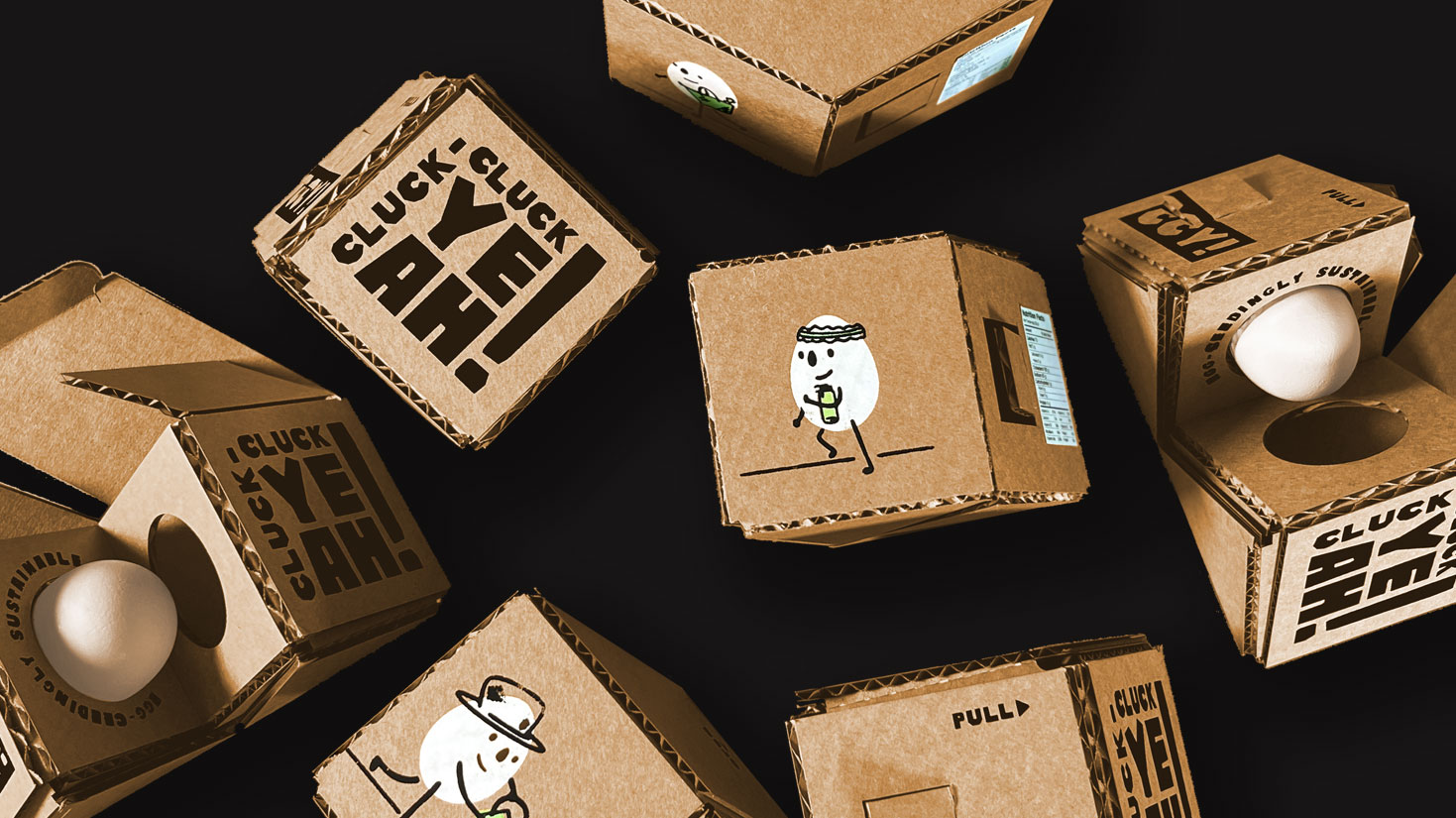
Cluck-Cluck Yeah!
This modular, adhesive-free packaging solution for Cluck-Cluck Yeah!, a sustainability-focused concept company, was designed to reflect their needs and values of functionality and sustainability. The playful design features joyful illustrations and typography, while a cost-effective three-tone color palette captures the brand's ethical and handmade spirit.
Project Scope
Logo development, illustration, die line creation, screen printing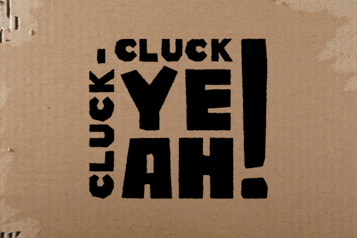
The Cluck-Cluck Yeah! logo's playful, chunky typeface conveys a DIY, sustainable vibe, evoking the look of cut construction paper.
Present a class full of designers with a traditional engineering problem, a 6-foot egg drop assignment, but tack on an identity development component.


The icon system
Each egg demonstrates a sustainable practice one can do at home. This design choice emphasizes CCY!’s values of sustainability and thoughtful consumption.


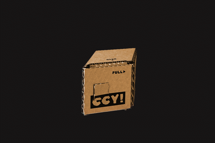
After experimenting with material thickness and folding methods, I developed a dieline solution that leverages the cardboard's corrugation to ensure durability and egg protection from drops of 6 feet or less.
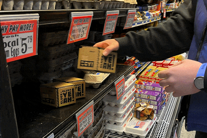
The brief specified that each package must hold only one egg. Though impractical for use in the home, this single egg packaging solution offers a joyful opening and handling experience.
