
graphic designer, multi-media artist, vegetable garden
Work
Design
Logos
Play
RISO Printing
Print Making
About
Contact
Resume

Premo Pilsner & Bridger Double IPA
Packaging and can designs for Premo Pilsner and Bridger Double IPA, two new additions to Bridger Brewing’s award-winning line-up of craft beers.
Project Scope
Illustration, Packaging Design
Client
Bridger Brewing
Sold year-round in stores, restaurants, and bars across Montana, Premo is a traditional German-style pilsner. The design on its can and box is classic, inspired by the bespoke and elegant script fonts and filigree illustrations common in the light beer lexicon, both craft and global.

Bridger Double IPA packs a strong 7.9 ABV. Featuring an illustration paying homage to Bridger Bowl Ski Area’s Slushman's Chairlift, ski patrol, and avalanche dogs, this IPA is bright, bold, and dangerous.

For this project to be successful, it was paramount that Premo Pilsner and Bridger Double fit well within the existing lineup of Bridger Brewing beers. By keeping consistent with Bridger Brewing’s established brand identity through layout choices and utilization of their primary font, DDC Hardware by type designer Arron Draplin, I was allowed freedom to be a little more playful with illustration and name wordmarks.

Premo 6-pack box dieline
Mirroring the layout conventions established in the wider Bridger Brewing identity system, this 6-pack box is inspired by the packaging of vintage beer cans with a thin green stroke border around each panel and a bespoke top panel featuring the Bridger Brewing logo in Premo’s green and gold color palette.


Bridger Double IPA 6-pack box dieline
Featuring a background illustration of the Bridger Mountain Range, a 40-mile subrange of the Rocky Mountains located just north of Bozeman, and the namesake of Bridger Brewing itself, this 6-pack box is sporty and eye-catching. The top panel highlights the illustration of the ski patrol woman, her avalanche dog, and the Slushman’s Chairlift from the Bridger Double IPA can.


Set against the backdrop of major college football towns, the "MeatEater Tailgate Tour" explores the connection between hunting and community. Each stop highlights the distinctive landscapes, flavors, and fan cultures that define the four locations visited on the tour: Penn State, UT Austin, the University of Michigan, and the University of Tennessee.
Project Scope
Layout Design for 2D AnimationsClient
Meat Eater


Twelve total 2D layouts created as a reference for animators
Aesthetically, the team wanted the 2d layouts to reference hand-drawn football plays and notes, archival imagery, wildlife, and unique indicators of place specific to the universities and their towns of origin. The goal here was to create a captivating, vintage-inspired visual language with special easter eggs for fans of each school.

The Credits
Animation
Annika Danenhauser
Annika Danenhauser
Animation + Post Production
Josiah Schwahn
Josiah Schwahn
Executive Producer
Spencer Miller
Spencer Miller
Graphic Design
Brook Price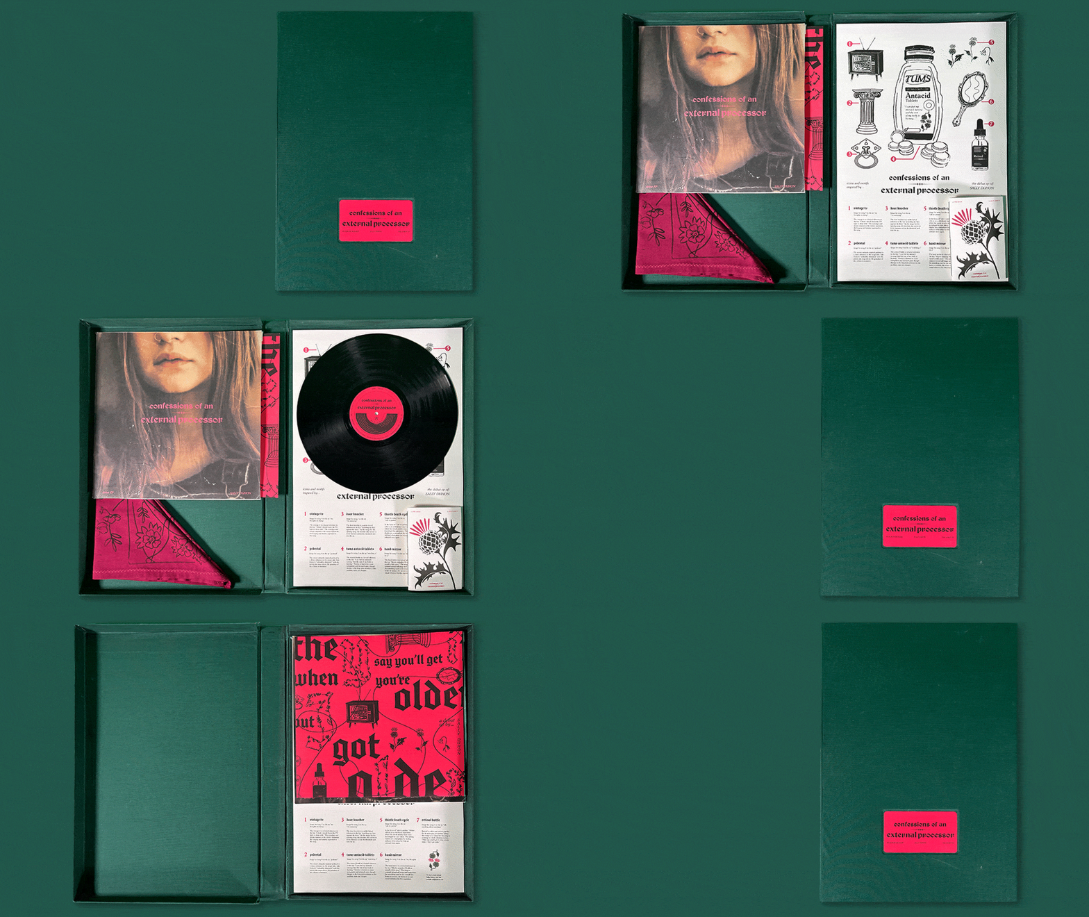
Confessions of an External Processor
Confessions of an External Processor, the debut EP by singer-songwriter Sally Duhon, explores the emotional difficulties of growing up, missing out on love, confronting family trauma, and learning self-acceptance.
Project Scope
Illustration, layout design, print design, bookbinding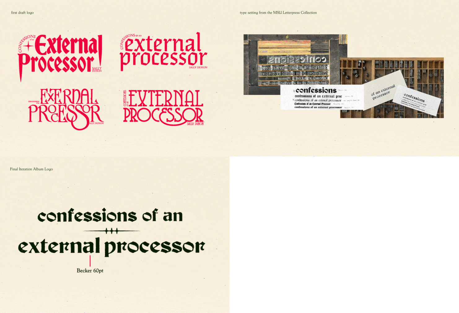


Color Palette and Aesthetic
To visually represent the contrasting lyrical and sonic qualities of the songs, the album package utilizes duality. Earthy tones interrupted by bold red, sharp black letter outlined in florals, tongue-in-cheek illustrations referencing pain. Together, these elements create a striking representation of the raw emotion conveyed in Duhon’s music.
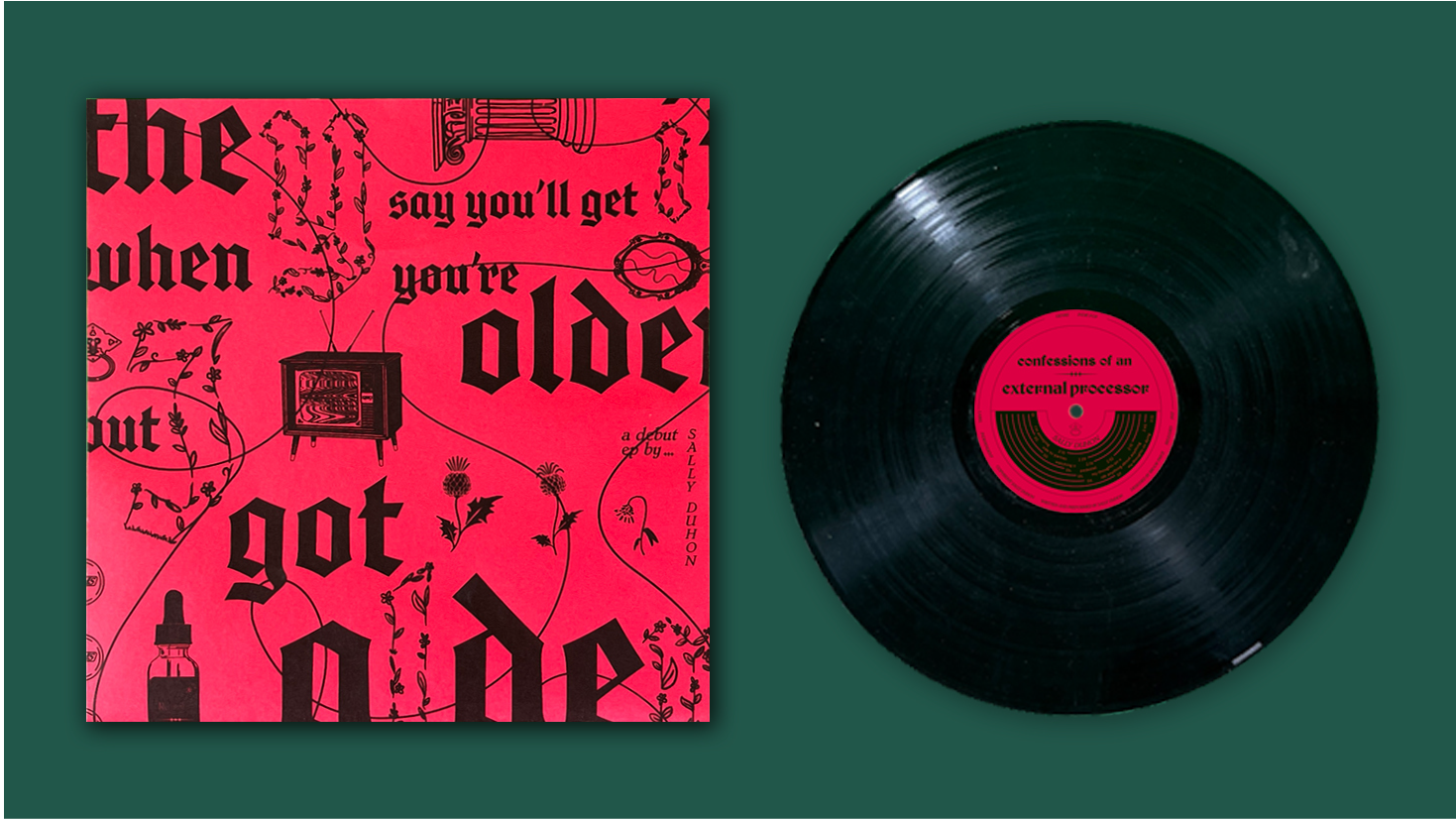
Sleeve and Record
The sleeve and circular label on the record contrast with the album cover. They are loud, red, and loaded with symbolism from the album. The floral outlined letters on the sleeve ensure that the contrast between them and the cover is not too harsh. They demonstrate the coexistence of vulnerability and boldness. As a unit, the sleeve, record label, and album cover embody the duality of the music. Soft and hard, bold and subtle.
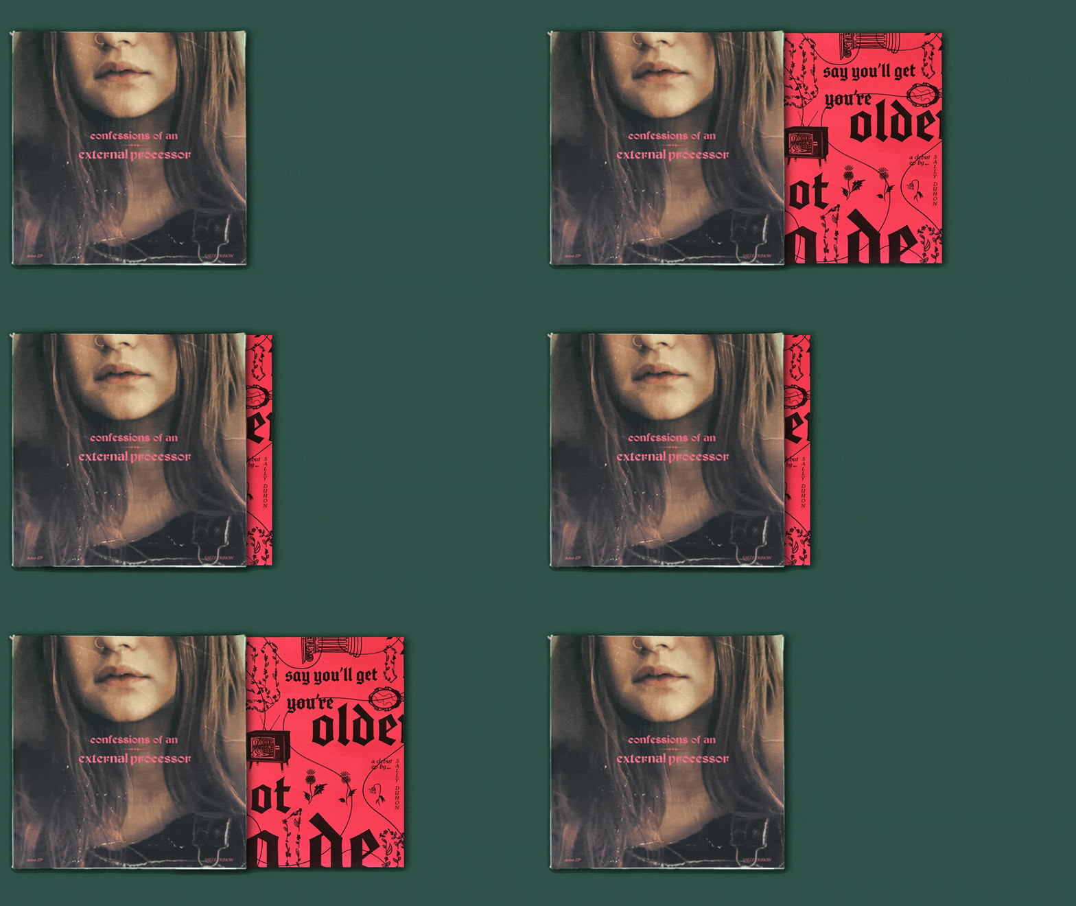

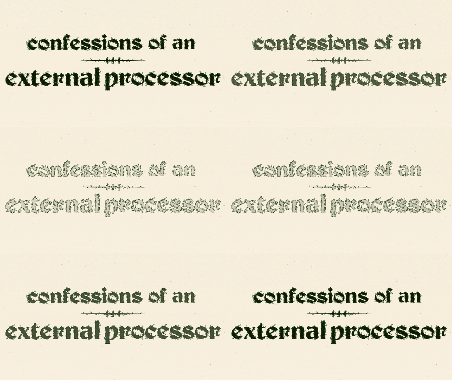
Example of Duality
The florals outlining the black letter album logo are referential to the contrasting lyrical and sonic qualities of the songs. Intense and feminine. Sharp and delicate.

The Poster explains the illustrated motifs from the Sleeve and Lyric Zine.

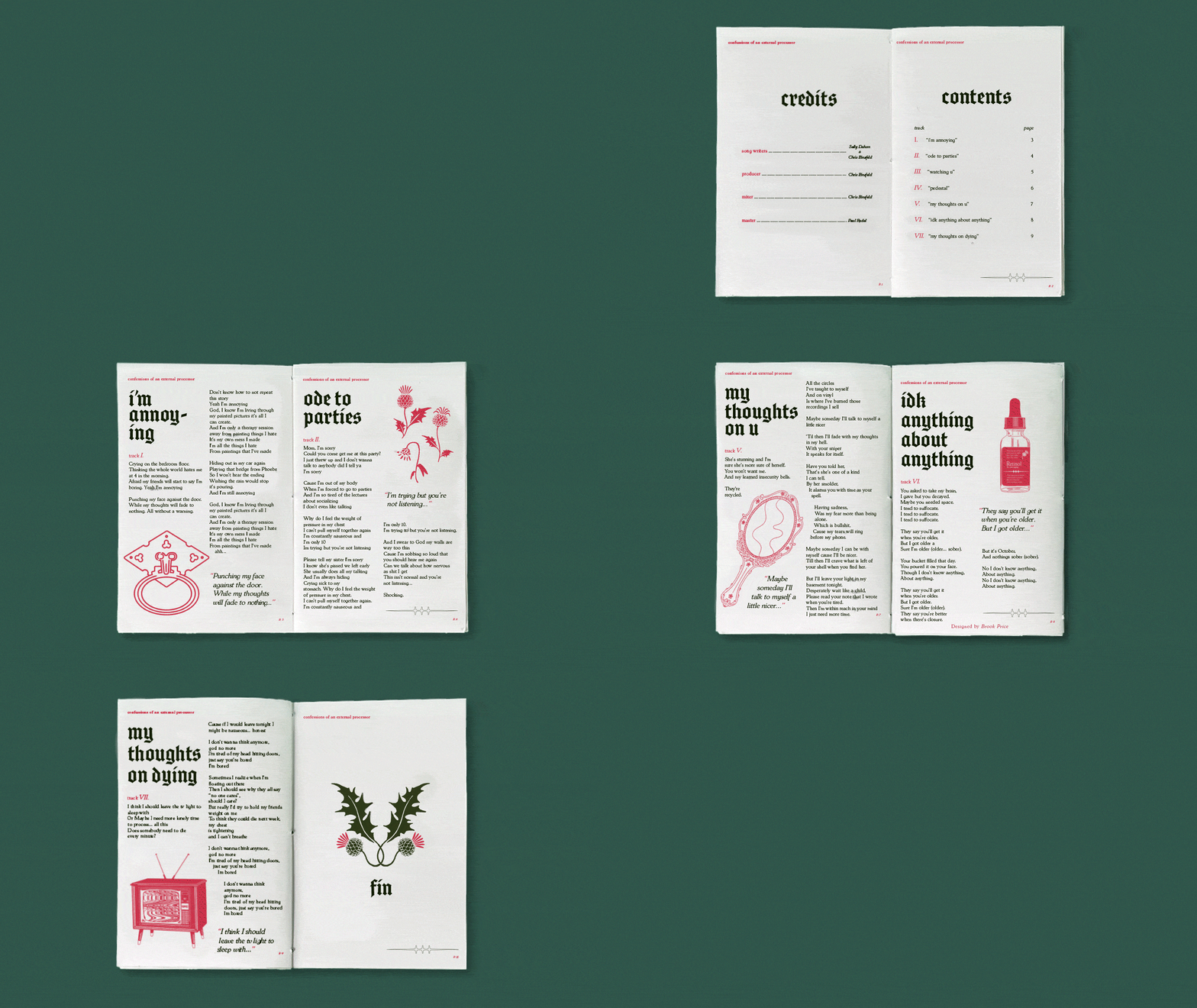
The Lyric Booklet
Drawing inspiration from the religious connotations of "confessions," The Lyric Booklet’s layout mimics that of a church hymnal. Each song is accompanied by an illustration referencing a poignant lyric. A door knocker represents "I'm annoying," wilting thistles symbolize "ode to parties," a hand mirror signifies "my thoughts on you," and an old school TV with eerie static embodies "my thoughts on dying." These visual cues enrich the EP's evocative lyrics with additional layers of meaning.

I created a clamshell box design for the album package to create a tactile and dramatic presentation, reminiscent of a storybook opening.


Morf Organic Tofu
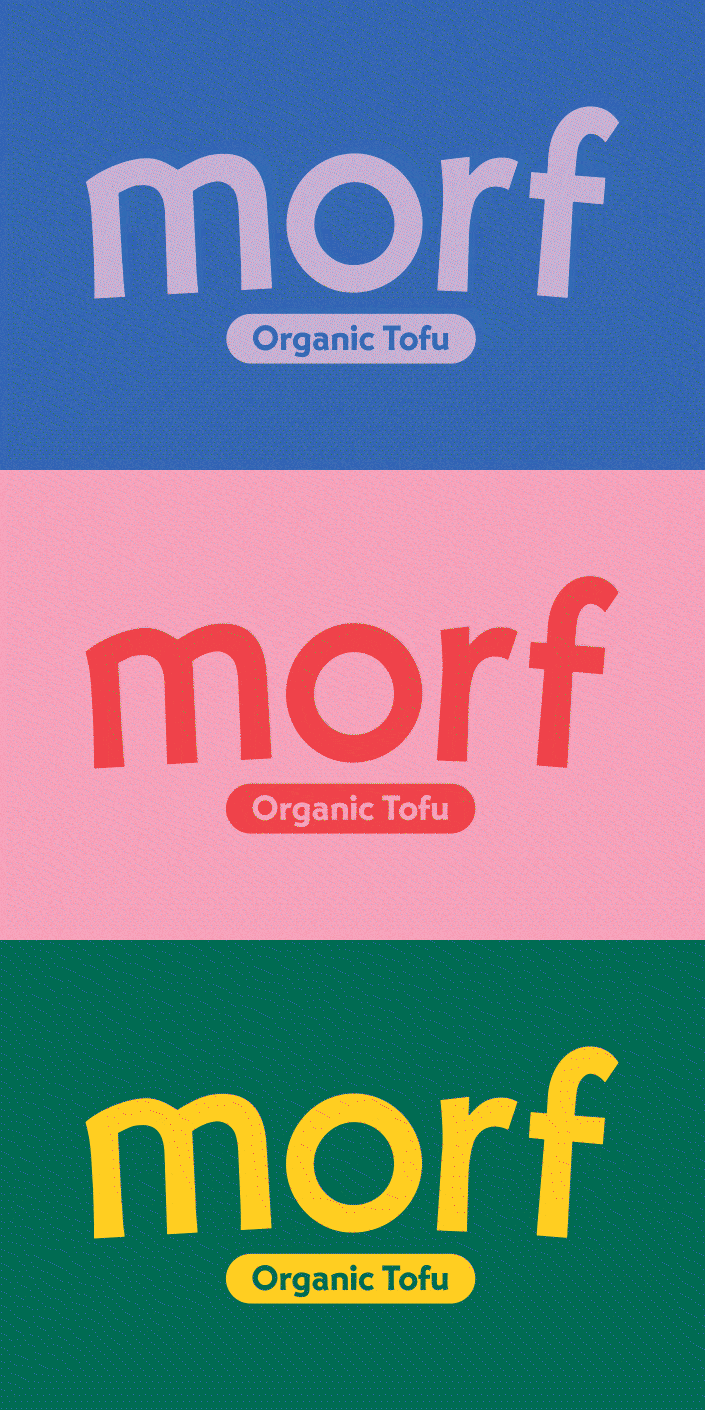
Morf Organic Tofu is a playful and unconventional concept brand that aims to breathe new life into the world of tofu packaging. Each type of tofu, silken, firm, and extra firm, is represented by a unique character hybrid inspired by mythological creatures. The intention with this concept is to demystify the idea of cooking with tofu by leaning into absurdity and showcasing tofu’s versatility through visual metaphors and offbeat characters.
Project Scope
Brand Identity, Illustration, Packaging Design, Screen Printing, Dieline Development


Stacking
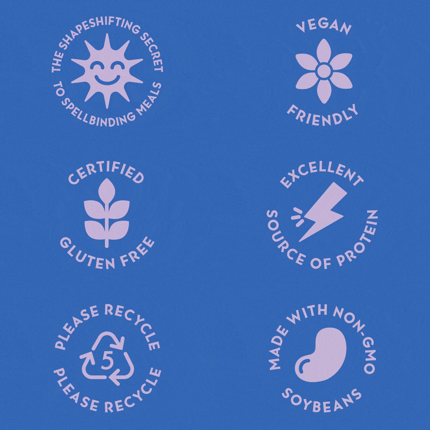
The company is called Morf to emphasize tofu’s ability to take different forms in different dishes. To visually represent this quality, I created a custom character for each tofu type (silken, firm, and extra firm) and laid them out so that their side panels are stackable. The idea here is for consumers to experiment with stacking to create different character hybrids and, in doing so, get excited to try out the tofu itself.


Zenyum
A conceptual logo, stationery system, and website wireframe developed for an invisible braces company that uses 3d printing to create custom braces and retainers.
Project Scope
Brand Identity, Illustration, Stationery, Web Design The wordmark features a custom sans-serif type with soft curves and a consistent stroke weight. The intention here is for Zenyum to nestle well within type traditions popular in the orthodontics industry while also reading as unintimidating and slightly techier than its primary competitor, Invisalign.
To further emphasize this unintimidating aura, the whimsical cat icon, a reference to Lewis Carroll’s Cheshire Cat (known for his smile and ability to turn invisible, just like the braces), is utilized across brand touchpoints in the stationery system and website wireframes.


The Stationery System
Notice the cat icon at about 10% opacity on the purple interior of the envelope, the back of the letterhead, and the back of the business card. His subtlety is intended to further hint at his invisibility powers. Like invisible braces, he’s only there if you really look.


Illustrated Appt. Card
Illustrative, joyful, and a little corporate, I designed this element of the stationery system to combat the stressful nature of the dentist. I figured that bringing a little lightness to the experience could help neutralize the anxiety it can produce. I also thought the card was a fun opportunity to utilize the entirety of Zenyum’s bold color palette in one place.


Infographic Illustrations
These spirited little numbers mirror the corporate, bright, and joyful style outlined on the back of the appointment card.